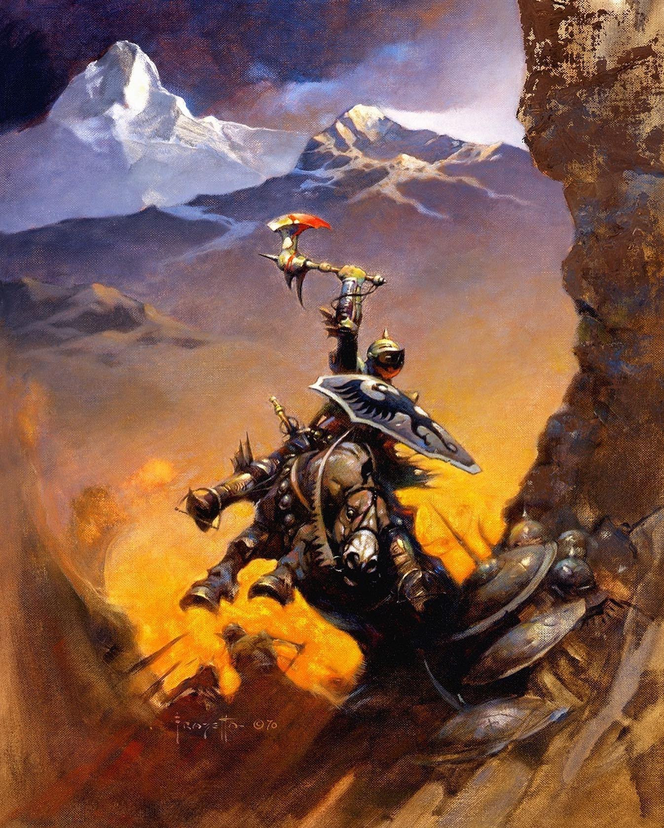
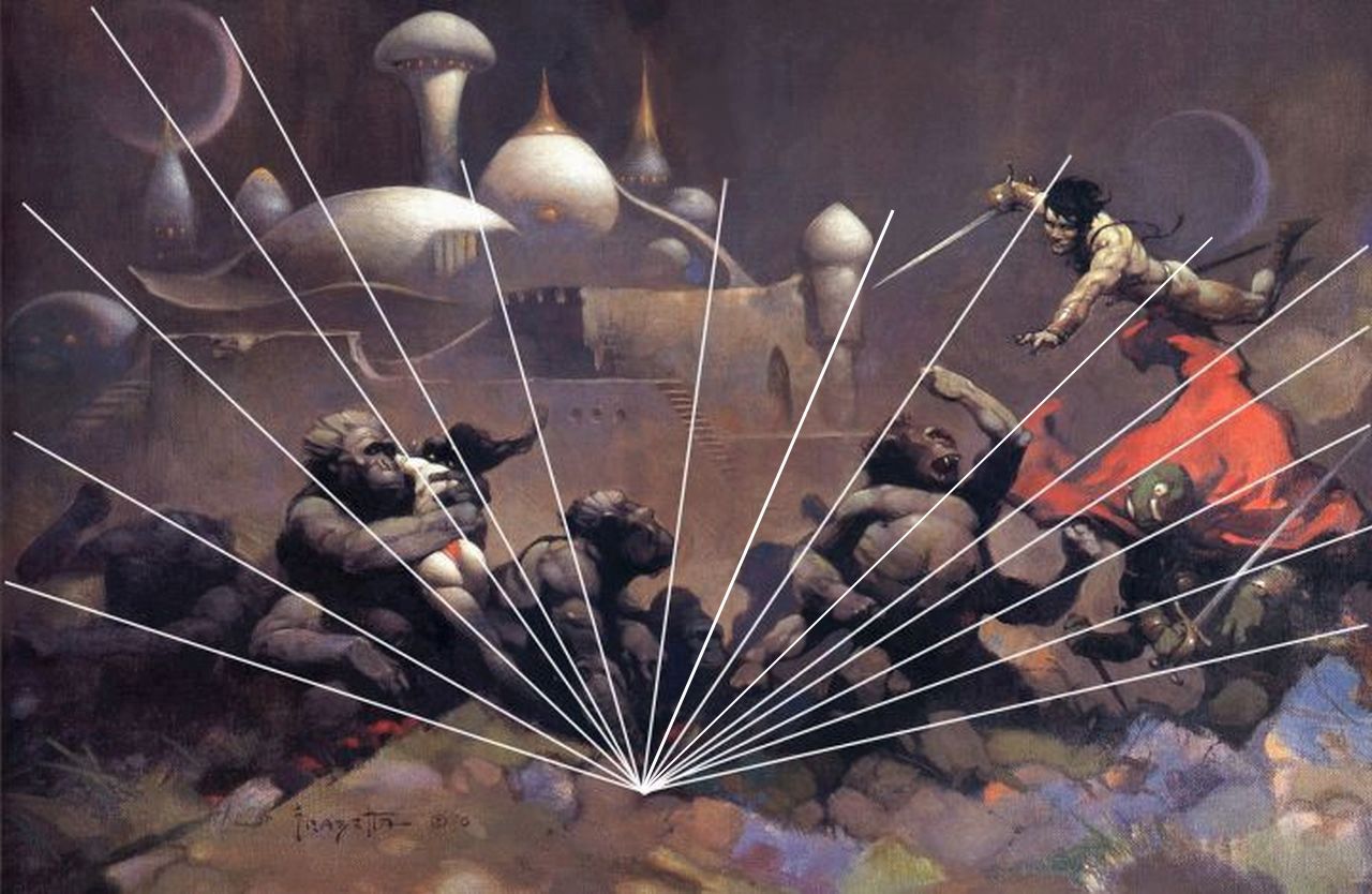
FRAZETTA: KING OF PAINT Chapter 9: 1972(Part 1)
by Paul Vespignani
MIDSUMMER CENTURY(1972)(oil painting)/MIDSUMMER CENTURY(aka BIRDMAN)(date unknown)(oil repainting)(copyright date 1972)
MIDSUMMER CENTURY(aka BIRDMAN)(date unknown)(oil repainting)(copyright date 1972)
This one is pretty simple: Frank added a half dozen or so abstract green spots to the original monochromatic Burnt Umber painting to give it a bit of extra visual interest. The green accented painting made its debut in FRANK FRAZETTA: BOOK TWO(1977) and(hard to believe) it was produced as a poster by Frazetta Prints. This poster raises an important question. Why were Frank and Ellie totally OK turning a relatively minor painting like this one into a poster while over a dozen major masterworks by Frazetta(I won't tax your patience by listing them specifically) were NEVER produced as posters?
NATIONAL LAMPOON 27(aka ALIEN CRUCIFIXION)(1972)(oil painting)(1st version)/NATIONAL LAMPOON 27(1972)(oil repainting)(published version)
Frank's initial instinct for this painting was totally correct. Not only does the alien look much better with legs, the whole composition looks much better when he has legs. Frazetta made the point of giving the alien FOUR ARMS and providing the alien cross with X-shaped cross bars(as opposed to the traditional t-shaped Roman cross) so that even the most dense viewer can very clearly see that this crucified figure is an alien and NOT a human being. Considering this, NL's request to have the alien's legs removed was unnecessary censorship overkill. However NL did give this cover painting top notch repro quality so it still looked good even in its sadly reduced state.
The 1st version made its public debut in FRANK FRAZETTA: BOOK FIVE(1985) but unfortunately the poor quality of this particular reproduction did not do it justice. It looks a whole lot better in the more recent release THE FANTASTIC WORLDS OF FRANK FRAZETTA(2022).
WITCH OF THE DARK GATE(aka SWAMP DEMON)(1972)(oil painting)(1st version)/WITCH OF THE DARK GATE(1972)(oil repainting)(published version)(copyright date 1968)
13 years after the publication of Frank's beloved cover painting for WITCH OF THE DARK GATE it was revealed in FRANK FRAZETTA: BOOK FIVE that an earlier and very different looking version of this cover painting existed. Frazetta liked this earlier version enough to take a color photo of it before painting over it. As was the similar case 1 year before for CONAN THE BUCCANEER(1971) Frank did an early version of the painting, photographed that version, and then did a major repainting and submitted the repainting to the publisher to be used as the book cover. With both of these paintings the Frazetta faithful assumed they were both done-in-one paintings because the contrary photographic evidence did not surface until many years later.
Looking at the 1st version of WOTDG all the basic compositional elements are already there: back view of a naked woman standing in the water in the foreground and an oversized creature looming in the background. Frank obviously had a major rethink and radically reimagined this original idea and changed everything very dramatically. The blond woman from #1 was transformed into a much larger scale Nubian woman(FF's own description of her) with a completely bald head and a fairly large snake wrapped somewhat suggestively around her. The oddball #1 creature almost looked like a mastodon who had been delivered by an alien mothership. The gigantic monster #2 looks like no animal or human on the planet Earth but is rather the personification of pure evil. Here Frazetta lets his imagination run wild and the triumphant result is truly wonderful.
The waterlilies and vines incorporated into the surrounding swampy landscape are all very nicely done.
ATLANTIS RISING(1)(aka ATLANTIS)(1972)(oil painting)(unfinished 1st version)(copyright date 1982)/ATLANTIS RISING(2)(1972)(oil repainting)(published version)(copyright date 1972)
The real life story for Frank's cover painting for ATLANTIS RISING is that he was about halfway into painting it when he realized he had miscalculated and did not have enough space for the water below the standing statue to provide the amount of statue reflection he wanted in the water. Under normal circumstances he would have simply redrew and repainted it on the original(and no one would have known the difference) but as fate would have it a family member was visiting his studio right at this time and provided Frazetta with a 2nd piece of canvas board to start all over again from the beginning. The half finished painting was gifted to the family member and a decade later FF signed and copyright dated it in 1982.
]]>
Black Emperor (1971)
Black Emperor(1998) (oil repainting)
NATIONAL LAMPOON 13(1971)(oil painting)
NATIONAL LAMPOON 13 (aka DESPERATION) (date unknown) (oil repainting) (1) (copyright date 1971)
FRAZETTA REWORKING NATIONAL LAMPOON 13(aka DESPERATION) (date unknown) (oil repainting(2))
CONAN THE BUCCANEER(1971) (oil repainting)(1) (published version)
FRAZETTA HOLDING CONAN THE BUCCANEER (1971)(oil painting)(1st version)
2) We have reliable eyewitness testimony from Michael Kaluta(who visited the Frazetta home multiple times in early 1971 before the family moved to the Poconos) that Lancer delayed the release date for CTB at least twice so Frank had this painting in his possession for almost 2 months...which was more than enough time for him to grow unhappy with the 1st version and do a 100% repainting of it. It is this repainting that he submitted to Lancer for publication.
THE DESTROYER(1971)(oil repainting(3))(copyright date 1971)
JONGOR OF LOST LAND(1970)
Tarzan ink drawing “Lord of the Savage Jungle”
The 1st 2 paperbacks I bought with Frazetta covers were CTB and CONAN OF CIMMERIA(1969). I purchased both of these books in the summer of 1972. I acquired them strictly for Frank's covers and certainly had no intention of reading them. However once I owned them I thought: why not read them? I read CTB 1st and enjoyed it. So in a weird way I have Frazetta to thank for my lifelong love of recreational reading and I was always very grateful to him for that. And yeah, I fully realize the irony that my very 1st Conan book was a novel by de Camp and Carter and not a short story collection by Robert E. Howard. I would soon enough learn to respect REH(and Roy Thomas too!).
I now think that the CTB cover painting and THE DESTROYER are equally excellent. I certainly can't objectively(or subjectively) pick a definitive favorite between these 2. If you ask a parent which 1 of their 2 children they love the most their knee jerk answer will always be: "I love them both." Same deal with me concerning these 2 paintings.
Since this was a 100% repainting I wish it had been done on a 2nd piece of canvas board with the 1971 original being spared.
THE DANCER FROM ATLANTIS(1971)(oil painting)
The pose of woman #2 is pretty similar to the pose of woman #1. Same back view, same angle of the head, and most importantly the same distinctive positioning of the legs. The main difference is that woman #2 is holding up both of her arms diagonally almost like she is a human TV antenna. Frank redraws woman #2 so she has much greater scale than woman #1 and she takes up much more space in the overall composition. Woman #2 is far more taut and sinewy(but still feminine) compared to the softer look of woman #1. And of course woman #2 is naked while woman #1 wears a triangular green fabric bikini bottom.
The back half of the bull is pretty much identical in the 2 paintings(with the bull visually bisected by the woman in the immediate foreground). Bull #1 is facing the viewer with his head in a full front position while the head of bull #2 is in pure profile. Bull #2 is mostly a large black mass with a minimal amount of light source somewhat rounding off the top edge of his form.
THE DANCER FROM ATLANTIS(1987)(oil repainting)(copyright date 1987)
Both versions of TDFA appeared side by side for their "better late than never" 1st ever Frazetta art book presentation in TESTAMENT(2001). This was also the public debut of the 1987 repainting.
]]>
A PRINCESS OF MARS (1)(1970)(oil painting)
A PRINCESS OF MARS (2)(1970) (oil repainting) (copyright date 1970)
As for the green, 4-armed alien on the ground I think his perfectly circular head from #1 works much better than his more oval shaped head from #2.
FRANK FRAZETTA: BOOK FOUR (1980)
THE ETERNAL CHAMPION PAPERBACK COVER (1970)(oil painting)
Frazetta's cover painting THE ETERNAL CHAMPION has always looked like an unfinished rush job to me, particularly in regards to its very simple yellow background. NOW when I look at the background the darker yellow tapered streaks almost look like Frank's quiet tribute to the tapered "action lines" pioneered by Jack Kirby and Joe Sinnott in their THE FANTASTIC FOUR comic books from the 2nd half of the 1960s.
Frank and Ellie apparently felt good enough about this cover painting to include it in FRANK FRAZETTA: BOOK FOUR (1980) and release it as a poster. However by 1994 the unfinished nature of this painting must have been bugging Frazetta because he gave it a 100% repaint(but maintained the original composition exactly) and made it even more than 100% better. This is probably Frank's most sensible repaint job: he took an unfinished painting and simply finished it. It is one of his best repaintings.
THE ETERNAL CHAMPION(1994)(oil repainting)(copyright date 1970)
The armored hero on horseback went from a sort of green monochrome in the original to more bluish silver tones better suited for armor with a nice red underglow added to his face plate. This red harmonizes nicely with the key focal point of his upraised bloody axe. The axe itself gets some much stronger white highlights and the axe blood has more subtle variations than the solid blood red of the original. The hero's shield has been completely reshaped and redesigned and is SO much better than the plain ol' shield of the 1st version. The horse also loses the green monochrome in favor of a much more sensitive horse colorations.
The simple yellow background is replaced by a beautiful landscape of arctic mountain ranges. Frazetta comes up with a powerful color scheme for this background with orange tones and Raw Sienna immediately surrounding the hero and his horse which slowly and surely modulates to the more cool colors of the landscape.
This repainting never appeared in Frank and Ellie's self published FRANK FRAZETTA: BOOK ONE (1996), but instead made its public debut in LEGACY (1999).
All things considered, the DEVIL RIDER repainting is superior to THE HIGH SIDE cover painting, although the blond woman in the magenta bikini from the original might be the most beautiful female Frank has ever painted. Why he felt that SHE needed to be repainted is something I will never understand(however blond woman #2 is also awesomely lovely).
DR is a 100% repaint but the drawings/composition of the standing male, the motorcycle, and the large laughing devil head in the background are all faithfully retained. The POSE of the #1 woman is reused for the #2 woman, but #2 woman has a completely different figure and face and her face is in pure profile(as opposed to the 3/4 view of the 1st face).
The laughing devil head in the background is given much more depth and color/value contrast and is more satisfyingly rendered vs. the much simpler light and middle gray tones the head was given in the original. Frazetta sticks with the original graphic design for the devil head but the head has far more color subtlety in the repainting.
THE HIGH SIDE(1970)(oil painting)
The motorcycle is repainted with brighter extra colors (compared to the monochromatic gray tones of the original motorcycle) and the male and female are given much more deeper suntans. Her bare breasts are somewhat whiter, indicating she has been sunbathing with her bikini top on..a nice visual touch by Frank.
DR made its 1st official appearance in FRANK FRAZETTA: BOOK FOUR, but was not deemed worthy by Frank and Ellie to be produced as a poster(why not?). Frazetta put a copyright symbol next to his signature, but no date. DR also made an earlier UNOFFICIAL appearance in THE FRAZETTA TREASURY (1975) which was a publication done without Frank and Ellie's involvement or approval. This means the DR repainting was done sometime between 1970 and 1975.
THE HIGH SIDE (aka DEVIL RIDER)(date unknown)(oil repainting)
STRANGE CREATURES FROM TIME AND SPACE(1970)(oil painting)
STRANGE CREATURES FROM TIME AND SPACE(date unknown)(oil repainting(1)
STRANGE CREATURES FROM TIME AND SPACE (date unknown)(oil repainting (2))
MONSTER FROM OUT OF TIME (1970)(oil painting)
Probably the most interesting thing about Frank's painting for JONGOR OF LOST LAND is that it looks more like a painting by Jeff Jones than it does a painting by Frazetta. For years Frank and Jeff were members of a 2-man Mutual Admiration Society so it should not be a surprise that Frazetta would do a Jones-style painting either consciously or subconsciously. Such a shame that this painting is so strangely flat and lifeless. In an audiotaped interview from 1994 Frank called the cover painting for JOLL: "a pretty hopeless piece of work."
One truly bizarre anatomical anomaly that these 2 paintings share is that both of the hero's arms do a complete disappearing act right around the elbows. I think Frazetta's original strategy here is that the 2 apemen are grabbing the hero's arms to restrain him and that THEIR arms and bodies would block the hero's arms(from the elbows to the hands) from the viewer. Unfortunately Frank did not convincingly pull this off in the design OR the figure drawing. The flaw is even more noticeable in the JAGUAR GOD 1 repainting because the JG character is much more contrasty than the more subtle painting of the Jongor figure. This situation is even exacerbated in the JG 1 repainting with only the tops of JG's legs showing(presumably they are obscured by the high jungle undergrowth, but this is only vaguely indicated). In the JG 1 repainting it looks as if the apemen are manhandling a head and a torso that has had his arms and legs amputated. Maybe FF was hoping that people would not notice this(or even worse, that they didn't care) but once you are aware of this it is kind of hard to NOT notice it.
If you are willing to overlook JG's freaky anatomy(and I certainly am) the JG 1 repainting really is a superb work of art featuring beautifully dark color combinations and a lush jungle atmosphere that is quite intoxicating. The JG 1 repainting is light years better than the totally failed JOLL cover painting.
It is intriguing that Frazetta repainted his 2 weakest paintings from 1970(JOLL and THE ETERNAL CHAMPION) in 1994. 1994 was a good year artistically for Frank. At that time he was enjoying a short lived oasis of good health with completely restored painting functionality.
The visual look of the JG character was most likely fully created by Frank in the repainting process with rocker/publisher Glenn Danzig coming up with the character's name and backstory based on the image. Glenn was borrowing a page from Stan Lee's "Marvel Method" playbook: have the artist do the heavy creative lifting and later shoe horn the word crafting in as a kind of afterthought.
Frazetta had zero interest in comic books by 1994, but he was OK using comic books as a venue for presenting his cover paintings to the general public. What Warren was to Frank in the 1960s and the start of the 1970s, Danzig's Verotik was for him during the mid -1990s.
Frazetta's all new painting for Jaguar God 2(1995) was one of his very best paintings of the 1990s and a painting that could hold its head high with any of the FF classics from the 1960s and 1970s.
JAGUAR GOD 1(1994)(oil repainting) (copyright 1994)
OUTLAW WORLD(aka WHITE GORILLAS)(date unknown)(oil repainting)
CREEPY 27(aka MONGOL TYRANT)
Around mid-1967 lack of magazine sales created a financial crisis for Warren which meant the company could no longer afford to pay their top 3 creators(Frazetta, editor/writer Archie Goodwin, and artist Steve Ditko(who in 1966 had split from Marvel, Stan Lee, Spider-Man, and Dr. Strange)). Goodwin got a writing job with Marvel which included a long run on IRON MAN. Ditko eventually gravitated toward DC where he created the character of the Creeper(CREEPY...the Creeper, get it?). Frank had plenty of work with his book cover and movie poster assignments. If he missed his creative freedom from Warren during those 2 years, the super-high paychecks he was earning from movie poster art meant he was crying all the way to the bank.
Warren economized by making the interior pages of CREEPY and EERIE either all reprinted stories or a mix of some new material and reprints. Jim Warren's initial gambit was to feature CREEPY reprints in EERIE and EERIE reprints in CREEPY as if he was daft enough to think that CREEPY readers never read EERIE or EERIE readers never read CREEPY. Warren didn't reprint the covers due to that being understandably confusing to the readers("Is this a new issue I just bought or an old issue I already own?"). However the new covers were of lower quality by lesser artists getting paid smaller rates than Frazetta(not that Frank EVER got any decent pay from Warren even back in the so called "good ol' days").
By early 1969 Warren's financial situation had improved enough so the company could afford to buy some new covers by Frazetta. Frank's slight return to Warren produced 2 cover paintings for CREEPY, 1 cover painting for EERIE, and 4 cover paintings for VAMPIRELLA(plus a handful of ink wash prototype drawings for the character of Vampirella) over the next 2 years.
Since the timing of Frazetta's breakup with Warren in 1971 perfectly coincides with he and his family moving to the Poconos, the Sherlock Holmes in me is tempted to see these 2 events as being causally connected(although I don't have a clue how). It is also quite likely that Frank's divorce from Warren was purely financial in nature. By 1971 book cover jobs were paying more than Warren and movie poster art jobs were paying a LOT more than Warren.
I have 2 theories about the CREEPY 27 cover(and I definitely favor Theory #1). Theory #1: Frazetta later gave the painting a 1967 copyright date which suggests he painted the 1st version in 1967. When he went to submit it to Warren he got the bad news they could no longer afford to pay him his usual rate. He held onto the painting for a year or so. Reportedly Ellie was so repulsed by the hideous face of the oversized monster in this painting that Frank made a point of always facing the painting toward the wall so Ellie wouldn't see it even by accident.
In early 1969 Frazetta got the green light to do more paintings for Warren. He already had this one in hand so it was the 1st painting out of the gate. Frank repainted the monster head to make it decidedly less frightening in deference to Ellie's feelings. Why he decided to make the 2nd head look like a fanged dead ringer for Genghis Khan is anyone's guess.
Theory #2 is that both versions of the painting were done in close time proximity to each other in early 1969 and that Frank got the 1967 copyright date wrong when he added it a decade later. I'm going with Theory #1 because I think it has more factual support from the evidence at hand.
CREEPY 27(1967 or 1969)(oil painting)(1st version)
Comparing the 2 paintings I really do prefer the 1st version. I have been a lifelong enthusiast of horror movies, horror novels/short stories, horror comics, and monsters so I find the hideous monster from the original painting quite endearing. I have a feeling Frazetta liked this 1st version too because he took the time and effort to shoot a good quality photo of it before repainting the monster head. This type of photography was something he usually didn't bother with whenever he did a repainting.
MONGOL TYRANT showed up in FRANK FRAZETTA: BOOK FOUR(1980) and became a poster for Frazetta Prints. The much lesser known 1st version made its first and only appearance in TESTAMENT(2001).
I believe the veracity of Frank's account, but my POV on this painting is somewhat different than his. First of all, I actually LIKE the face on the EERIE 23 cover painting much more than I like the repainted face(which is also perfectly fine). While Frazetta thought his 3 day ordeal in repainting the face ended in failure, I think it ended in success. The somewhat anxious expression on the first face tells the story beautifully: EQ is frightened by the big cat approaching her so she is shrinking back in fear against the big pillar. So what does the tranquil and emotionless facial expression of the 2nd face tell us? That the big cat is her domesticated pet so she is not worried about its approach? Is that even a believable scenario?
I have a feeling that the repainted face is an early strategy in Frazetta's long game of repositioning himself from being an illustrator to being a fine artist. Maybe he felt the anxious face was too connected to storytelling, and in his way of thinking that made it an illustration. However the emotionless face completely divorces the image from storytelling altogether and the viewer is invited to view it as just a beautiful picture with no specific storytelling meaning. And, of course, it IS a beautiful picture.
EERIE 23(aka EGYPTIAN QUEEN)(1969)(oil repainting)(copyright date 1969)
Frazetta's now-classic cover paintings for EERIE 23 and VAMPIRELLA 1(both magazines were cover dated September 1969) were a powerful one-two punch that sold a lot of magazines for Warren at a time when they really NEEDED to sell a lot of magazines to be fully pulled out of the financial funk that had largely crippled the company over the previous 2 years. VAMPIRELLA was an all new concept and had all new contents. CREEPY and EERIE would continue to limp along for the rest of 1969 with partial reprints. By the start of 1970 all of the Warren mags had all new stories and art.
VAMPIRELLA 1(1969)(oil painting)
Considering the popularity of Vampirella in general and the popularity of Frazetta's cover painting for VAMPIRELLA 1 in particular, it has always seemed very VERY strange to me that Frank and Ellie never included this painting in any of their 1st generation FF art books or produced it as a poster for Frazetta Prints.
While it is probably impossible for me to pick out my favorite Frazetta repainting, it is super easy for me to identify my LEAST favorite of Frank's repaintings: it is nude Vampirella.
In 1991 Frazetta made the decision to paint out Vampirella's red bathing suit costume and black boots, make her completely nude, and soon after sell off the repainting at auction. The problem here was that the 1969 original had a very simple composition which worked great for that painting but it also means that every element of the design is of key importance. The red and black colors were not incidental; they were actually very crucial to the painting's visual success. When Frank painted out the red costume and the black boots the composition pretty much imploded into near-nothingness. What we are left with is an anonymous naked brunette woman standing in a spotlight...which looks REALLY stupid(and I'm being polite here).
VAMPIRELLA 1(1991)(oil repainting)(copyright date 1991)
]]>VAMPIRELLA 2(aka VAMPIRELLA 1996)
Few fans of Frank Frazetta would characterize him as an abstract artist, but on rare occasions, Frazetta did veer into the realm of abstract art and even surrealism to achieve a particular effect, or perhaps because that fit the needs of a particular assignment, or simply out of a desire to try something new. Frazetta is best known, of course for his paintings of heroic figures like Conan the Barbarian, Tarzan, John Carter of Mars, Brak the Barbarian and a whole slew of brawny, larger than life men and voluptuous women.
Downward To Earth
Another example of Frazetta using an abstract technique is in his striking painting for the paperback collection The Devil’s Generation (Lancer Books, 1973). Here, he uses an abstract impasto technique to depict the black magic energy being summoned by the skull-faced sorcerer. It’s not easy to see on the paperback cover because the title lettering obscures most of it, but as shown on prints, the wild, splashy energy really pops. Some of the magical energy looks like Frazetta employed the action painting technique of splattering paint pioneered by abstract expressionist Jackson Pollock. Again, this is a departure from Frazetta’s usual approach that had intriguing possibilities had he chosen to pursue it further.
Devil's Generation
Torment
Other examples of Frazetta employing a level of abstraction are the many paintings when Frazetta allowed the Masonite texture to show through on the works he executed using that type of painting surface. The first example of this technique, and one of his most famous works, is “Neanderthals”, done for the cover of Creepy # 15. It’s remarkable not only for the end result, but also because of the backstory of this masterpiece. This story has been told many times, so I’ll keep my recounting of it brief. Frazetta did this painting in 1966. He had a Monday deadline for his next Creepy cover, and as usual, Frazetta put off the job until the last minute, preferring to play sports or basically do anything but painting. Sunday rolls around and goes into the evening and Frazetta does not have a single piece of canvas board or anything else on which to execute his assignment, and living out in the wilds of 1960s Pennsylvania, the nearest art supply store is many miles away, and would’ve been closed on a Sunday night anyway. Ellie Frazetta was very upset, fearing Frank would blow his deadline, so she went to bed early with a headache.
However, after she turned in, Frank was struck with an inspiration. Remembering that there was some construction going on in the basement, Frank went down there, pried up a piece of Masonite from the floor and took it into his studio. Then he fell to work, knocking out one of his absolute masterpieces in around six hours. Frazetta used the brown of the Masonite to frame the primitive cavemen shambling towards the viewer through a curtain of mist. The only evidence of the haste with which this piece was executed is an indistinct face visible in the background that Frazetta only partially painted over. When Ellie emerged from the bedroom the next morning, she found Frank having coffee, with “Neanderthals” on his easel. When she expressed her surprise that he produced a painting in such a short time, Frazetta acted like it was no big deal.
Neanderthals
Cover artwork for Vampirella #5 (Artwork titled "Cornered")
He could have easily gone back and finished up the foreground, covering the Masonite as he did with the reworked version of “Kavin’s World”, but as far as I know, he never did. A later Warren magazine cover is “Nightstalker” the cover to Creepy #32 (April, 1970). As with many of his paintings, the composition is simple but effective, his use of color is moody, conveying an atmosphere of subtle menace, of unimagined horrors soon to be released on an unsuspecting world. In kind with his cover for Vampirella #5, Frazetta allows the Masonite background to peek through figure and foreground, and it’s barely covered by the swirls of mist around the left side of the figure as if Frazetta did a few quick strokes to mute the background.
Idomitable
CREEPY 16 COVER (1967)(oil painting)/Creepy 16 (aka CAT GIRL)
I don't interpret the 1984 copyright date as definitive proof that Frazetta did the CAT GIRL repainting in 1984. More likely Frank and Ellie compiled the contents for FRANK FRAZETTA: BOOK FIVE as early as 1984 and he used the then-current year of 1984 as the copyright date. I'm not a betting man, but my gut instinct tells me Frazetta probably did the CAT GIRL repainting sometime in the first half of the 1970s(and I have no way of actually PROVING that beyond a shadow of a doubt).
While the 1st 4 Frazetta art books were closely tied in to the contemporaneous Frazetta Prints poster business it is extremely odd that NONE of the paintings that appeared in FRANK FRAZETTA: BOOK FIVE were produced as posters at the time of this book's publication. Ultimately 4 paintings from the book became posters(including the CAT GIRL repainting) but that only happened some years down the line.
WOLFSHEAD PAPERBACK (aka GREEN DEATH(1))(1967 or 1968)(oil painting)(copyright date 1967)
As it was with the similar cases involving MASAI WARRIOR(1960) and A PRINCESS OF MARS(1970) Frank and Ellie made the financial decision to sell the original art for WOLFSHEAD(aka GREEN DEATH) to an art collector in 1980 with Frazetta being immediately tasked to do a likewise repainting of it(to replace the one that had been sold) for the family art collection. Just a coincidence, but it is interesting that these 3 repaintings were spaced exactly 10 years apart and each was painted in the 1st year of a new decade.
Since the original GD painting was a vertical 16 x 20 rectangle it is a bit puzzling why Frank decided to do the repainting as a substantially smaller 12 x 12 square. As most artists will be happy to tell you, painting somewhat bigger is more physically comfortable than painting somewhat smaller. So why did Frazetta voluntarily make things more difficult for himself by replicating this painting at such a small size? Of course doing a painting with this level of realistic detail on an original essentially the size of a record album cover was a truly awesome technical achievement by Frank.
Where the repainting takes some major liberties is in the depiction of the woman in the middle ground and the wizard in the far background, and both are majorly improved in the repainting. The back view of the presumably helpless woman lying on the ground in the original has been replaced with a much more appealingly proactive woman in a more upright position and she is beautifully drawn and painted by Frazetta. Another big plus is that the shape of the figure of woman #2 has a much greater design synergy with the overall composition which has much greater unity in the repainting.
In Frank's cover art for CONAN THE AVENGER the painting of Conan has a lot working against him: a daft looking helmet, a doofus facial expression, and swinging arms in an ape-like positioning. Frank was right when he said the 1980 repainting of this Conan figure was greatly improved, although I always thought Conan #2 looked a bit like an underdressed football player(not that there's anything WRONG with that!).
If you take a look at Frank's subgenre of movie poster art it is quite obvious that United Artists was his most frequent employer. He did far more movie poster art jobs for UA as compared to any other movie studio. To the best of my knowledge THE NIGHT THEY RAIDED MINSKYS was the one and only time UA censored or interfered with Frazetta's art, but in this particular case they went WAY overboard. It is pretty easy to view UA as the villains in this situation. Not only did they have the unmitigated audacity to ask Frank to further cover up his already tastefully rendered burlesque women, but they also gave him a ridiculously long list of actors and actresses they wanted added, deleted, substituted, or altered from Frazetta's original painting.
As always Frank was a pro and complied with all of UA's many unreasonable demands, most likely keeping in mind the extra large paycheck he would earn in the end for this piece of movie poster art.
There is plenty of visual evidence that Frazetta's original uncensored painting for TNTRM has survived over the years and that he did not do any repainting or revisions directly on the original art piece.
Taking into account that the published art seen on the movie poster and accompanying soundtrack album cover is a sort of 50/50 split between the original painting and the boatload of revisions, I have come up with a plausible theory of how Frank(perhaps with the assistance of a UA production artist) accomplished this hybrid image without destroying the original:
Generally speaking movie companies kept the original art done for their movie posters. This bothered Frazetta but he saw it as an acceptable tradeoff for the substantially higher paychecks he got for movie poster art compared to the much lower fees he was more regularly earning for the book and magazine covers that were his artistic bread and butter.
The uncensored painting of TNTRM received its public debut 10 years after the movie release in FRANK FRAZETTA: BOOK THREE(1978).
by Sara Frazetta
Animation of Darkwolf from Fire and Ice (1983)
Frazetta on set of Fire and Ice (1982)
Frazetta's Teegra Concept Art
Because this movie held a special place in my grandfather's heart, it has remained incredibly dear to me since the day I first watched it. After the live-action film fell through, Fire and Ice remained a cult classic that lingered in the shadows. It resided on platforms like YouTube and other free streaming services, gradually fading from conversations. It needed a revival but it wasn't happening without some conscious effort. It wasn't until writer Bob Freeman reached out to me on Twitter with an unexpected proposal. He asked if I had considered creating a role-playing game based on the film Fire and Ice. I had never considered it, but I found the idea intriguing. I approached the Ralph Bakshi family, who co-owned the property, and they were enthusiastic about expanding its potential. We immediately started working on the RPG with Bob Freeman, which eventually led us down other creative paths, such as the world of comics.
Having previously collaborated with Nick Barrucci of Dynamite Entertainment on Vampirella, we knew he would be a great fit for this property. Together, we brainstormed and searched tirelessly for the right creative team. Making my grandfather proud became my driving force throughout this endeavor, and I placed a crazy amount of pressure on myself to get everything to a standard of excellence. I knew what questions to ask and what qualities to look for. When I saw Leonardo Manco's art in Opus Publishing's Death Dealer issue #4, I knew he possessed a remarkable talent. His art resonated with me, and I could envision my grandfather raising an approving eyebrow at his work. Manco's art carried the same emotional depth and power as Frazetta's, reminding me of my grandfather's final comic, titled "Werewolf." When Manco joined the team, I was overjoyed and relieved. I couldn't imagine proceeding without him. From the moment I saw his art, I had a gut feeling that screamed "yes."
Leonardo Manco's Interior Art for Issue #1 titled "Good In Life."
When we received the first script from Bill and saw Leonardo's character art, we knew we had struck gold. My grandfather would have been pleased, and that meant we had succeeded. I understood the significance of this endeavor, and mediocracy was not an option. I have immense faith in this series. It embodies so much heart and adventure, employing the art of traditional storytelling through exceptional world-building. I can't wait until fans read issue #1 which will be in stores on August 2nd and can be pre-ordered at FrazettaGirls.com. Please leave a comment and let us know what you think! Long live Frazetta!
Wrap around cover artwork by Leonardo Manco
]]>Sara Frazetta in Frank Frazetta's studio with the original Fire and Ice artwork (1990)
Thanks to movieweb.com for this blog’s title.
EERIE 3(1966)(oil painting)
Frank's repainting of SEA MONSTER has a real formal perfection that is superior to the original cover painting. The only elements that were retained from the original were all in the foreground: the undersea diver, the treasure chest, a skull, and a few fish. The larger area of the background with the oversize monster and the surrounding underwater space were completely reimagined in the repainting and all given a beautiful dark menace.
I still have a lot of fondness for the original EERIE 3 cover painting with its complex network of textures, bubbles, and fizzy colorations. Although the repainting is obviously better I still wish FF had spared the original version and did the repainting on a 2nd piece of canvas board.
EERIE 3(aka SEA MONSTER)(date unknown)(oil repainting)(copyright date 1966)
EERIE 5(1966)(oil painting)
The cover painting for EERIE 5 was relatively simple and effective: a classic T rex style dinosaur looming in the reddish background with a back view of 2 guys standing in a lake in the foreground. For the repainting Frank just painted the 2 guys out of the painting, which only served to prove how important they were to the original composition and the whole image really suffers without them. The fact that guy #1 was wearing a bright red jacket and guy #2 was wearing a bright green jacket might seem odd fashion wise, but it makes complete sense when you consider the red and the green were the absolutely perfect color accents for the overall compositional color scheme. For Frank everything was subordinate to color and design at all times.
EERIE 5(aka SWAMP GOD)(date unknown)(oil repainting)
CREEPY 11(1966)(oil painting)
KING KONG(1)(1976)(oil repainting)(copyright date 1976)
This chain of paintings is also a painful reminder of how truly reckless Frank could sometimes be concerning the value of his own art. In 1976 he had no problem sacrificing one of his best CREEPY cover paintings to do an almost completely unrelated Kong painting. In 1979 he was perfectly on board with sacrificing THAT painting to facilitate another almost totally different Kong painting. For the very small amount of dollars it would have cost to buy 2 pieces of 16 x 20 canvas board in the mid to late 1970s he could have painted the 2 Kong variants on those boards AND preserved the CREEPY 11 cover painting. If he had done that we would have been left with 3 great pieces of original art instead of just one.
KING KONG(2)(1979)(oil repainting)(copyright date 1979)
EERIE 7(1966)(oil painting)
There are 2 questions that need to be asked here: WHEN did Frazetta become disenchanted with the original figure of the sea witch? And: WHY did he become so disenchanted with her?
The somewhat more pretty repainted sea witch looks perfectly fine, although she has lost much of the wonderful malevolent quality of the first sea witch. We should count ourselves lucky that Frank never repainted the superb raging seascape that makes up the overwhelming majority of the total composition.
Frazetta has stated publicly in an interview that he struggled with the repainting of the sea witch figure. That in and of itself should have told him(and us) that he would have been much better off to let it be with this painting and he should have just left it alone.
At this point it seems logical to point out the fact that repainting a masterpiece under any circumstances is always risky business. The creative chain lightning of inspiration and improvisation that results in a particular masterwork may only strike once in a lifetime(if an artist is lucky enough to have it happen at all). To expect that same magic to occur a decade later(or 2 decades later) during a revision painting session is sheer folly. I think Frank was really pushing his luck with this repainting.
I remember reading an interview with Bob Dylan back in the 1990s where he was moaning about how effortless it was for him to write and record songs back in the 1960s compared to his long creative dry spell in the 1990s. He said something along these lines(and I am paraphrasing here): What once came easy now comes hard. As it turns out Dylan's creative dilemma was pretty similar to Frazetta's own. Back in 1966 Bob and Frank were at the top of their games and could literally do no wrong. Decades later it was a totally different story for these 2 esteemed gents and unfortunate circumstances sometimes made any creativity at all extremely difficult.
EERIE 7(aka SEA WITCH)(oil repainting)(date unknown)(copyright date 1966)
MONSTER MANIA 2(1966)(oil painting)
Frazetta had temporarily moved himself and his family to California in the early 1980s in order to work with Ralph Bakshi on their co-produced animated movie FIRE AND ICE(1983). As a sort of recreational sideline in 1981 Frank worked on repainting his caveman epic landscape YOUNG WORLD which was originally a wraparound cover for MONSTER MANIA 2(cover date January 1967, released late 1966).
MONSTER MANIA 2(aka YOUNG WORLD)(oil repainting)(1981)(copyright date 1981)
Like CONAN THE ADVENTURER(1966) this is a really large size original for Frank measuring in at 22.5 x 35. Also like CTA it was painted on a stretched canvas. Since the wraparound cover for MM 2 was double the size of a regular magazine cover the bigger original makes practical good sense.
As was the same case for EERIE 3(aka SEA MONSTER) from earlier in 1966, the original version of YOUNG WORLD was far more fun while the repainting was quite a bit more respectable. Does that sum up the difference between "illustration" and "fine art"?
Frazetta's repainting of THE BRAIN was pretty concise: for the back view of the lower warrior holding his sword in a horizontal position Frank repainted his right shoulder area. It is unlikely any viewers noticed the difference.
FF gave this painting a 1967 copyright date in the mid-1970s. GCD says that EERIE 8 went on sale at newsstands, etc. the last day of 1966. If you figure 3 to 5 months are needed to pre-produce a horror comics mag like EERIE this means for sure Frazetta painted THE BRAIN in 1966.
EERIE 8(aka THE BRAIN)(date unknown)(copyright date 1967)
The alignments and intersections don’t occur with mathematical precision but they are darn close to it. I don't believe that Frazetta sat down and mathematically gridded-out his compositions in advance. He would not have had the patience to do that. This is something that was intuitive, based on his sense of drama and the desire to get a powerful emotional response from the viewer. These things don’t happen in every single piece of art he ever created, but they do show up in a number of his paintings. The following diagrams are examples that I created using Photoshop. On the rest of the diagrams, all you have to do is pick a circle or line and follow it to see where and how objects intersect or align with them.
Objects that align or intersect on lines that extend from a single point give the picture a sense of visual symmetry in an area or an entire image. Besides the lines that extend from the single point, this image (A Princess Of Mars), shows an additional vertical line to the right side of John Carters face on the vertical
center of the picture that extends down and multiple objects align to it.
With this picture, (Warrior With Ball And Chain), there are actually two points that could be used to align things. One point is offscreen to the right and another at the base of the warrior’s right leg.
As I mentioned earlier, this isn’t a matter of mathematical precision but more of a
general design. There are more paintings that can be diagramed and it can be fun to do. To me it’s just another example of how truly amazing Frazetta was.
Despite the fact that dozens of excellent artists have assayed their versions of Howard’s glowering Cimmerian barbarian, including Boris Vallejo, Joe Jusko, and Frazetta protégé Ken Kelley, Frank Frazetta remains the artist most closely associated with Conan. His Conan paintings, executed in the mid-60’s, and sometimes revised years later, remain the classic images of Conan. There are many reasons for this, but perhaps the most important one is Frazetta’s innate ability to convey unbridled savagery, something many of his imitators just couldn’t achieve. Another reason for this is: Frazetta really created a visual vocabulary for Conan, and, by implication, for the entire Hyborian Age. Of course, in discussing this aspect of Conan iconography it is fair to acknowledge, as Frazetta did, the contributions of Roy Krenkel. In the front matter of each of the Lancer Conan books for which he painted covers, Frazetta thanked Krenkel, listing him as a “Technical Advisor.” It’s safe to assume that with his broad knowledge of earlier illustrators, coupled with his knowledge of historical armaments and costumes, Krenkel was certainly an invaluable resource for Frazetta. It’s also reasonable to assume that Frazetta consulted with Roy Krenkel because of his superb sense of design and composition.
Above left: Roy G. Krenkel [1918-1983] Above right: Frank Frazetta [1928-2010] (www.muddycolors.com/2021/06/a-little-frazetta-conan-history)
Roy Krenkel, a peripheral contributor to Creepy and Eerie, worked up a series of pencil roughs which he passed on the Frazetta as possible cover ideas. (Krenkel’s pencil rough for Frazetta for Creepy #7)
John Milius and Larry Torro aka Rubber Larry's custom Conan the Barbarian Mask.An autographed photograph from Arnold Schwarzanegger with his Canvas Print of Conan The Adventurer, gifted by Frazetta Girls.
In the intervening years, the Conan paintings, including The Destroyer, Frazetta’s impressively reworked painting for Conan the Buccaneer, have remained steady sellers as posters. The Destroyer is so popular that it has even been used as a patch design for a unit of the U.S. Army, for which the Army gave Frank a citation. Military types really seem enamored of Frazetta’s macho warrior images. His Death Dealer became the mascot of the U.S. Army’s III Corps in 1985, and in 2009, a larger-than-life-sized Death Dealer statue, dubbed “The Phantom Warrior” by the Army, was installed in front of III Corps’ headquarters at Fort Hood, Texas. Frazetta’s Conans are also finding new life and even greater popularity as limited-edition statues and collectible figures, even Frazetta Girls Christmas ornaments.
Clayburn Moore’s Conan the Barbarian statue
Frazetta Conan Holiday Ornament by Frazetta Girls
Sculptor Clayburn Moore’s Barbarian statue, based on Frazetta’s final version of the painting for Conan the Adventurer, is a magnificent rendition of the character in three dimensions. Two other Conan paintings, the cover for Conan the Conqueror, and the cover for the proposed but unwritten Sons of Conan book, provided the basis for two of the Frazetta Master’s series of collectible figures. Technically, the cover for Sons of Conan was never used for its intended purpose, and in The Fantastic Art of Frank Frazetta Book V, the painting was retitled Charging Huns. Although many fans don’t know this, there is still another, largely unseen Conan painting. Originally intended for a King Conan novel, it was never used because of Lancer Books’ demise. Unfortunately, the original was stolen from the Lancer offices back in the ‘60s and is still listed as a stolen painting with the FBI. King Conan has seen print however, as the cover of the 1975 bootleg fanzine The Frazetta Treasury, and was also included in the gallery of Conan paintings reprinted in Icon: A Frank Frazetta Retrospective (Underwood Books, 1998). Frazetta has also repainted the stolen canvas, and the repaint is better than the original. Yet, Conan is not the only Howard character Frazetta brought to life. His version of Bran Mak Morn for the eponymous Dell paperback is absolutely the definitive version of Howard’s dark Pictish king. For Lancer, Frazetta also did the cover for Wolfshead, a collection of unrelated short stories.
Bran Mak Morn artwork by Frank Frazetta
While the Wolfshead cover doesn’t depict a specific story or character in the collection, and, in fact, was originally intended to be the cover of Brak the Barbarian, it nicely captures the mystery and violence that imbues all of Howard’s heroic fantasy tales. Bran Mak Morn is one of Frazetta’s most powerful and trenchant depictions of barbarism. However, despite the power of this image, Ellie Frazetta once mentioned in passing that the painting is one of the least popular of Frazetta’s oils with his fans. Perhaps they were put off by the painting’s somber color scheme of earth tones, or the grim stillness of Bran’s advance. Personally, I love this painting. Frazetta’s image of Bran, a Pictish king at the head of his inexorably advancing barbarian horde, perfectly captures the moody and understated tone of Howard’s Pictish tales. Frazetta even includes a joke in the painting that most fans missed. Conan’s horned-helmeted head is visible on a pike in the background. So, once again, Frazetta scores a bull’s-eye. Though it must also be noted that Barry Winsor-Smith came close to the master with his melancholy watercolor painting of Bran, done for a color portfolio depicting half a dozen of Howard’s characters that was issued in the mid-70’s.
Frank Frazetta pictured with his original artwork "Conan The Usurper" AKA Chained
Frazetta's Conan of Aquilonia
Frazetta's painting for Conan the Adventurer has subsequently become one of the most famous images in the annals of fantasy. Interestingly, Frazetta did two other Conans that were vaguely similar in their compositions, if not in their actual execution: Conan the Buccaneer and Conan the Warrior. Both show Conan battling atop a pile of enemy bodies. But the two works are distinctly different in look and in the moods they evoke. It must be noted that the next painting to consider, the cover for Conan the Warrior, retitled Indomitable for its issuance as a poster, is one of Frazetta's favorite of the Conans. In Icon, Frazetta observed, “Most artists and art directors favor Conan the Warrior. The design makes it one of my personal favorites but I know it’s not as popular with the fans as my painting for the Adventurer. Interestingly, most book editors favor the cover for the Conqueror. Perhaps it’s more commercial. I don’t know.” That said, I have to break with the master on this painting. In my opinion, Conan the Warrior is Frazetta's least successful depiction of Conan.
While I can appreciate the power of Frazetta's overall design, and its painterly qualities, the small figure of Conan at the apex of the composition seems too blocky; the rendering on the figure looks too rushed, unfinished. To me, the central figures small size makes him too remote, too distant to evoke much of an emotional reaction from the viewer. Also, the rendering of the entire painting lacks the polish that makes the other Conans so frighteningly vivid. Frazetta's usually impeccable color sense seems to have failed him here; the colors in the foreground are too muddy and drab to really grab the readers attention. To my eye, this is one painting that Frazetta should have taken back to the drawing board and reworked. “Well, these covers tend to be many things to many people,” Frazetta commented.
However, the reworked Conan the Buccaneer painting, retitled The Destroyer fully justifies the additional time and thought Frazetta expended on it. He took a great painting and reworked it into a full-fledged masterpiece; arguably the best depiction of Howard's Cimmerian anti-hero done by any artist anywhere. In this powerful painting, Frazetta takes the same basic composition as Conan the Warrior and brings Conan down to a point just above the viewer's eye level and moves in so close you can almost feel the hot gore spattering on your face. Unlike the small, foreshortened figure in Conan the Warrior, this Conan is close enough that you can see the feral gleam of barbarism flashing in his eyes. To me, this is what Conan should look like: savage, implacable, like a coiled cobra ready to lash out in a burst of deadly speed. However, Indomitable is virtually the only weak link in the Conans. The rest of them rank among Frazetta’s very best work. Conan the Warrior does have power and energy; from any other painter, this would be a
noteworthy depiction of Howard’s character. In my opinion, Frazetta set his own bar so high with the other Conans that this piece suffers by comparison. The Destroyer takes virtually the same idea and expresses it in a far more forcefully, due in no small part to the more polished rendering that enhances the realism and brings home the violent nature of Conan’s world with inescapable ferocity. In looking at the evolution of Frazetta’s Destroyer it’s interesting as an example of Frazetta’s perfectionism and his habit of tinkering with paintings with which he’s dissatisfied. Although Frazetta’s fans can regret losing any of his paintings, his repaints were generally improvements over the originals.
Frank Frazetta's repaint of Conan The Buccaneer titled "The Destroyer"
His reworkings of several Conan paintings are excellent examples of this. Frazetta’s first published version of The Adventurer, while a powerful, well-designed composition, is clearly unfinished. The version seen in volume one of The Fantastic Art of Frank Frazetta is one of the most definitive renderings of Conan. His reworking of the cover for Conan the Avenger is another example of a painting that was vastly improved by Frazetta’s tinkering. A comparison of the two versions shows that the artist extensively reworked the figure of Conan, greatly improving the anatomy and giving him a more brutal visage. For me, as for many fans of Howard’s sullen Cimmerian, Frazetta’s paintings crystallized our mental images of Howard’s most famous creation. Aside from The Death Dealer, the Conan paintings are arguably Frazetta’s best-known work, prized by his vast legion of fans, and lusted after by well-heeled collectors, including Metallica’s Kirk Hammett, who paid one million dollars to own Conan the Conqueror back in 2009. In 2010, an un-named collector shelled out 1.5 million dollars to own Conan the Destroyer and prices have only gone through the stratosphere since then. To cite an unrelated example of how the value of Frazetta’s best work has increased. Frazetta's daughter, Holly Frazetta sold the Egyptian Queen painting recently for a record-breaking 5.4 million dollars, and A Princess of Mars sold in 2020 for 1.2 million dollars. Although Frazetta was not approached to do a new Conan painting for the movie poster. for Conan the Barbarian, the more reworked version of The Barbarian was used to promote it in Europe. Copies of this poster are highly sought after among American Frazetta fans.
Frazetta's Conan the Conqueror AKA Berserker
If anyone thinks I have skipped over Frank's repaintings for 1965, this is not the case. As it turns out, FF did not repaint any of his paintings that were originally published in 1965. Perhaps for Frazetta AND Sinatra it could be said of 1965: IT WAS A VERY GOOD YEAR.
Frank's repainting for TOMORROW MIDNIGHT was highly unusual because it was specifically requested by the publisher Ballantine Books.
FF's first version of the painting featured a hermit-like abandoned astronaut with long hair and no shirt with accompanying aliens on a cratered planet surface and a ringed world in the interstellar background. Although lonely and desolate are not moods that we would typically expect from a mainstream Frazetta painting, both feelings are perfectly captured in this specific painting.
When Frank submitted this painting to Ballantine Books they asked him to give the astronaut a shorter haircut and more clothing. Since FF preferred his original version he elected to not paint over it and kept it for himself and instead did a 2nd painting featuring a more conservative looking hero for publication. Other than the obvious differences of the main character Frank very closely replicated everything else almost exactly in the 2nd painting. This is a good example of how FF could be a very disciplined artist when he needed to be(or wanted to be).
Comparing the 2 paintings, Frank was definitely right that his 1st version was much better artistically and had far more impact emotionally.
Both paintings feature an unusual combination of oil painting and pen and ink drawing. To accomplish this it looked like FF did the oil painting part first and after the oil paint had fully dried(with the drying time perhaps hastened by the kitchen oven) Frank did the pen and ink drawing over it to give the composition(s) additional sharpness and delineation.
Russ Cochran reportedly purchased the 2nd version of the painting directly from Ballantine Books. Which raises an interesting question. Since the return of the original art was a standard of Frank's contract with the various publishers he worked with by 1966 why was this piece an exception? Did FF voluntarily forfeit the 2nd painting to the publisher because he did NOT want it back? At least if he had gotten it returned he would have received however many dollars RC paid for it, which only seems fair since Frank had to do this painting TWICE to please Ballantine and I'm guessing they only paid him one fee for it.
Ballantine published TOMORROW MIDNIGHT in the middle of 1966 which would have given Frank plenty of time to do both paintings in 1966. Stylistically it is obvious he painted them back to back with no other paintings in between. While it is possible he did the 1st version in December 1965 and the 2nd version in January 1966 that seems almost too neat to be true. More likely the 1965 copyright date for the 1st version was simply an incorrect memory from more than a decade later.
The public debut of FF's preferred 1st version of STRANDED appeared in FRANK FRAZETTA: BOOK TWO(1977) and was also a poster from Frazetta Prints.
TOMORROW MIDNIGHT(aka STRANDED(1))(1965 or 1966)(oil painting + pen and ink)(1st version)(copyright date 1965)
TOMORROW MIDNIGHT(aka STRANDED(2))(oil repainting + pen and ink)(2nd version)(copyright date 1966)
Not only is CONAN THE ADVENTURER one of Frank's greatest paintings, it is also one of his best repaintings as well. It is a repainting that actually makes some logical good sense. Here he was taking an already excellent painting and making it even better with precise additional details and subtle improvements.
Comparing the published CTA cover to the repainting, there are multiple details added to the Conan figure. A scar is added to his left cheek. Some red highlights are added to his lower lip. His earrings are given more definition and highlighting. His neck area has some tonal variance mixed into the shadow area. His right hand is far more rendered and larger. His right leg has been darkened.
The most obvious aspect of the repainting is that Conan's woman companion has been completely reinterpreted. Compared to her more ethereal and atmospheric look in the first painting she is far more distinct and has more volume(and seems somewhat bigger in scale too). Although her face has been completely repainted her features are still in soft focus because FF didn't want her facial features to take attention away from the Conan figure. Frank gives her 2 additional golden armbands on her left arm which are actually in far sharper focus than she is. The armbands are an additional touch that works beautifully.
Although Frank should not be considered a photo realistic painter(and regularly eschewed photo reference to work more from imagination and memory) for this particular painting he uses the basic photographic principles of sharp focus and soft focus as compositional tools. The Conan figure is in sharp focus and deep detail. His female companion and the wide array of fascinating background elements are all kept in soft focus. This puts all the visual emphasis on Conan.
At 20 x 30 this painting was an unusually large original for a Frazetta paperback cover painting. It is also probably the first cover painting that FF painted on a stretched canvas as opposed to the more normal board surfaces. So this was a very special painting for Frank no matter how you look at it.
I bought THE FANTASTIC ART OF FRANK FRAZETTA when it was first published in the autumn of 1975. I was 15 years old at the time. Looking through the book I noticed that FF had repainted CTA compared to the cover of the Lancer paperback. I also noticed that he had added the date of 1974 to this painting. I put these 2 things together in my head and came to the conclusion that this meant he repainted it in 1974. Now I am not so sure about that.
Frazetta had a legal obligation to add copyright symbols and copyright years to these 30 paintings before they were reproduced and printed as posters. Before 1974 Frank only put his famous signature on the paintings, he didn't date them. For some of the paintings he used the then-current year of 1974. For others he used his memory to get as close as possible to the actual year he painted them. Sometimes his memory was absolutely spot on. Other times, not quite.
In retrospect all of us(including FF) would have been better off if he HAD dated all of his paintings going back to 1963 in the real time of the actual years that he first painted them. That would have been far more reliable than the hit or miss of the copyright dates from memory. However since these retroactive copyright dates are more often correct than incorrect they are not totally useless, especially when establishing a date on a repainting that we have no other info about.
At some point Frank changed the copyright date on the CTA repainting from 1974 to 1965.
My belief that CTA was originally painted in 1966 is based on what we know about the book's publication history. We know that CTA was Lancer's first Conan paperback. We also know it was the ONLY Conan paperback they published in 1966 and that they published multiple Conan paperbacks in the following year of 1967. Putting all this together it seems we are on safe ground in establishing that CTA was published in the 4th quarter of 1966(Lancer only listed the year a book was published in the front of the book, not the specific month of the year). This means that if Frank did paint CTA in 1965 that Lancer sat on it almost a full year before publishing it. I find that almost impossible to believe.
My best guess is that when the Lancer office first saw FF's then-revolutionary and totally unprecedented painting they would want to rush it into publication ASAP in anticipation of all the books that cover would sell for them. And of course that is exactly what happened when they DID publish that book. Many people bought the book strictly for the cover, and if they actually read it was completely besides the point. Even Frank himself has pretty much publicly admitted that he couldn't be bothered to fully read the Conan stories and that this painting was his personal interpretation of what a barbarian should look like.
I have no idea when FF did the repainting of CTA and I don't think anyone else knows either. However I am fully confident that whenever he did do it he was fully aware of this painting's central importance to his life and career and tread very carefully with the repainting process and did so with a lot of tender loving care. Which was the smart thing to do!
CONAN THE ADVENTURER(1965 or 1966)(oil painting)
]]>CONAN THE ADVENTURER(aka THE BARBARIAN)(date unknown)(oil repainting)(copyright dates 1965/1974)
FRAZETTA: KING OF PAINT
Chapter 2: 1964
by Paul Vespignani
The 2 different versions of THE MAD KING have provided a Frazetta mystery that perplexed me for a full 50 years before I finally learned the solution in 2022. On one hand we have the cover art for the 1964 Ace paperback of ERB's THE MAD KING which is a bonafide FF masterpiece. On the other hand we have an alternate version that appeared as the cover of Ace's 1972 rerelease of THE MAD KING that looks like it was painted by a completely untalented FF imitator. How in the world was I supposed to reconcile (or even understand) these 2 wildly divergent paintings?
The real life explanation is as entertaining and brilliant as a plot for MISSION:IMPOSSIBLE. Frank came up with a great idea to recover his prized piece of original art for TMK from the clutches of Ace(this painting and the original for TARZAN AND THE JEWELS OF OPAR were his most valued Ace ERB paintings). Frank asked Ace if he could briefly borrow the painting on the pretext that he wanted to take a photo of it for his files. They agreed and lent him the painting. Meanwhile FF very quickly knocked out a poor quality copy of THE MAD KING painting and returned THAT painting to Ace. They were so completely clueless that they didn't even notice the difference!
Flash forward to 1972 when Frank is kicking off his wonderful second wave of ERB cover paintings for Ace. Either he or they decide that he won't do a new painting for TMK and instead Ace will just reuse the older one. Only in THIS case the older one that they still have in their possession after 8 years is now the inferior copy. They go ahead and use it anyway, thus creating a maddening mystery for Frazetta fans like me who were clearly far more observant than they ever were.
In 1977 Frank repurposed the original TMK masterwork as both a poster for Frazetta Prints and a fine highlight of FRANK FRAZETTA: BOOK TWO.
THE MAD KING (1964) watercolor repainting
SAVAGE PELLUCIDAR(1)(1964)(watercolor painting)/SAVAGE PELLUCIDAR(1)(aka THE HUNTRESS)(oil repainting)(copyright date 1977)
Frank was always quite fond of the effective vignette composition and powerful use of white negative space for SAVAGE PELLUCIDAR(1), another one of his early Ace ERB faves. Stung by Ace taking ownership of the watercolor first version he later did a likewise oil repainting of the composition for himself and even managed to somewhat monetize it as a poster and included it in FRANK FRAZETTA: BOOK TWO(1977).
Comparing the 2 pieces I definitely prefer the oil repainting. FF was careful to retain all of the positive elements of the original watercolor for the oil repainting and in addition it was far more polished and sophisticated stylewise. It is hard to know for sure if the 1977 copyright date(clearly added AFTER the darker signature) means that Frank actually PAINTED this oil version in 1977 or if he was just going by the year it was first released to the general public.
For my money the original 1964 THE REIGN OF WIZARDRY was among the greatest of FF's early masterpieces. It is a stunning swirl of color, texture, and highly imaginative imagery. If there was ever a Frazetta painting that did NOT need to be repainted, it was this one. So perhaps it can be considered the very grimmest irony that FF chose THIS painting as a sort of weirdo recreational project, repainting it countless times over the span of several decades.
Considering we have never seen a high quality photo of the 1964 first version of this painting we are quite lucky that Lancer gave it a truly excellent repro job for the first edition paperback. Unfortunately they were also very generous with the overlaying cover typography as well.
Throughout all of the many repainting of TROW Frank never repainted the large demon figure in the center of the design. He only repainted the multiplicity of figures framing the demon, particularly in the foreground area.
The real problem of the repainting is stylistic inconsistency. The large demon maintains the lively painterly color from the original while the surrounding figures become increasingly more slick, belabored, and tonal. It is almost as if 2 totally different paintings are at war with each other while trying to share the same compositional space.
Another very problematic element of this ongoing repainting was that everytime FF redid the figures they seemed to get more and more sexually explicit. It got to the point that Ellie had developed such a serious moral objection to this painting that she refused to let it be displayed in the Frazetta Art Museum, never turned it into a poster for Frazetta Prints, and never allowed it to appear in any FF art book.
Family friend Robert Barrett really liked this painting and was gifted with a photo of it circa late 1967. Frank and Ellie only asked that he not reproduce the photo while they were still alive. RB kept this pact for decades, with the somewhat faded photo being revealed to the general public in late 2014.
Arnie Fenner was quite keen on including a then-current photo of THE REIGN OF WIZARDRY repainting as a special addition to his 16 page bonus folio section in the back of the deluxe edition of TESTAMENT(2001). This way at least 1200 Frazetta faithful on the planet Earth would finally get this image in book form. Arnie even made a specific trip to the Frazetta homestead to shoot the photo transparency. When he saw the painting, he was horrified to discover that Frank had whited out multiple figures with white gesso paint in preparation to repaint them yet AGAIN. Arnie understandably didn't want to present this long awaited painting in his book with a bunch of white blobs and blotches on it, so Ellie's boycott indirectly remained in effect.
As for me, I finally got my copy of this repainting in THE FANTASY ART OF FRAZETTA calendar 2018. It was literally the only reason I bought the calendar.
The first repainting I am covering here has an unusually complex backstory for a Frazetta repainting and is also an interesting slice of Frazetta history coming at a crucial turning point in his art career. Tarzan and The Ant Men was painted as a sort of "try-out" to show the editorial department at Ace Books the general idea of what a Frazetta/Tarzan cover painting would look like. Ace never used this painting as an actual book cover, and it is highly doubtful that they gave Frazetta any financial compensation for the time and effort he put into it. On the plus side, he was able to retain the original art for this watercolor painting, which is more than can be said for the originals of any of his printed first wave Edgar Rice Burroughs Ace cover paintings.
In 1970, Frazetta agreed to allow Vern Coriell to reproduce this painting for the first time for an ERB fanzine. Coriell dragged his feet for a full two years before returning the original art to Frazetta sometime in 1972. At this point Frazetta repainted parts of the painting in oil paint while leaving other parts as-is, creating an unusual kind of watercolor/oil paint hybrid.
Two years later, in 1974, Frazetta and his wife, Ellie were actively involved in trying to recover the original art for his cover of CREEPY #9 (1966)(aka WINGED TERROR). In 1967, Frank sold that original to Robert Barrett for only $300 USD. This was a bargain price even by 1967 standards and strongly suggests that Frank had very little regard for this painting back then. However, in the intervening seven years, both Frazetta and Ellie realized that this particular painting was a fan favorite, and that they had made a major tactical blunder in letting the original art for it slip out of their possession. Barrett was familiar with Tarzan and the Ant Men and quite liked it. He asked if Frazetta would be willing to fully repaint it in oil paints and then trade that for the CREEPY painting. Frank answered in the affirmative, fully repainted TATAM in all oil paint and swapped it with Barrett to obtain the WINGED TERROR original.
There is no question in my mind that the 1972/1974 oil repainting is far superior in every way compared to the 1962 watercolor. Having said that, the 1962 original still has a nice quality to it. To the best of my knowledge this was the first and only time Frazetta did an oil repainting over a watercolor original.
Olympic swimming champion, swimming coach, entrepreneur, TV host, stockbroker and King of the Serials, Buster Crabbe was an American institution for several decades, which is why he is still being talked about, written about, and having his visage used in comic book art and illustrations. In addition to his serials, films, Olympic career, and varied businesses, one thing that made Crabbe into such a pop culture icon was his appearances in comic books. In all, there were two different editions of Buster Crabbe comics from two different publishers (Famous Funnies and subsequently, Lev Gleason), as well as a comic book version of Captain Gallant of the Foreign Legion, his syndicated TV series in which Crabbe co-starred with his son, “Cuffy”. The four issues of this title were published by Charlton Comics, and none of the Fleagles worked on it. In many of the comics in the Famous Funnies Buster Crabbe series (published from 1951-1953), the stories and covers, and even some ads, were drawn by Al Williamson and Frank Frazetta, either working solo, or assisted by Roy Krenkel, George Evans or Joe Orlando.
One or more of the Fleagles had art in a total of seven of the twelve issues published. The second series of Buster Crabbe comics published by Lev Gleason, The Amazing Adventures of Buster Crabbe (published from 1953-54), only lasted for four issues, although Williamson and the other Fleagles had completed a story and a cover intended for the fifth issue that did not see print for twelve years. It is this story, untitled in its earliest iteration, but later rewritten by “honorary Fleagle” Wallace Wood and re-titled “Savage World”, that represents the absolute apotheosis of the Fleagles as a creative team. Its creation involved Williamson, Frazetta, Torres, and Krenkel, and it is truly one of the most beautiful stories ever created for an American comic book. When the comic was cancelled, the publishers offered to pay all the writers and artists for their completed work, but Williamson, who had poured his heart and soul into this story, asked if, instead of receiving payment, he could just get his art back. His editor at Lev Gleason probably thought Williamson was nuts, but agreed to return his artwork. Williamson loved this story and hung onto it for many years, not knowing if it would ever see print. However, one day in the mid-60s, old pal Wally Wood asked Al if he could print the story in his new prozine (at
first titled etcetera, but soon to find lasting fame as Witzend.) Al agreed, and Wood wrote a new script around the existing eight-page story, titling it “Savage World”, and giving the old Buster Crabbe story about battling an advanced race of subterranean aliens a new, more sardonic spin. So, in 1966, over a decade after it had originally been drawn, this Fleagles masterpiece was finally published. The combination of Wood’s intelligent (if rather cynical) sci-fi script and the
gorgeous art made it an instant classic, and it’s been reprinted a number of times since then, notably in the first issue of Marvel’s black and white science fiction anthology, Unknown Worlds of Science Fiction, which allowed Williamson to finally pay Torres for his work on the story, since he had paid Frazetta and Krenkel for their contributions back in the ‘50s; but then it was republished in color in Alien Worlds #4 by Pacific Comics, retitled "Land of the Fhre" with yet
another rewritten script, this time by Bruce Jones, and then “Savage World” was published once more (in black and white this time) in Death Rattle #10 from Kitchen Sink.
It’s one of those stories that’s too good to stay out of print for very long, and has been a favorite of Fleagles afficionados for decades. In the book, Al Williamson Strange World Adventures (Flesk Publications, June 2021), Angelo Torres recalled working on this now-classic story. “At its inception and for years to come, the job would be referred to as ‘The Buster Crabbe job’,”…“It became ‘Savage World’ when the story was rewritten. Working with Al meant working at his place in Brooklyn. I would show up around noon and stay until late in the
evening. During that time, we might hike down to the secondhand bookstore to rummage, watch some TV and enjoy his jazz collection. Roy would drop by and spend a day, then take pages home to do his work on the backgrounds. Frank would drive over, do some of the inking and hang out for a few hours before heading home with a page or two to do the same. “I was sitting with Al one evening as the job neared completion when he posed a new problem: ‘How will the story be signed after four guys had worked on it?’ We half-jokingly tried to figure out what to do when Al came up with an answer: ‘How about Alfange Krenzetta?’ At which point he laughingly decided to go with just plain Al Williamson.” However, in addition to drawing Crabbe in the two Buster Crabbe comic book series, Williamson and Frazetta also drew him in one panel (Page Six, Panel Five) in the story, “The Vicious Space Pirates” (Danger Is Our Business #1, Toby Press, 1953), which was reprinted by IW in Danger Is Our Business #9 (1964). And in the story “Spaceborne” (Weird Science #16, 1952) Williamson drew a protagonist who greatly resembled both Buster Crabbe, and Alex Raymond’s Flash Gordon. To be honest, many of the blond males Williamson drew throughout the ’50s resembled Raymond’s Flash. In his obituary for Williamson, Mark Evanier paraphrased a statement by the artist, “Al used to joke that all the heroic males he drew either looked like him or like Mr. Crabbe.” Frazetta, who got his own newspaper strip, Johnny Comet, about an itinerate race car driver was soon out of work, when the strip was canceled after about a year and a half. He tried to create other newspaper strips, Amby Dexter (about an ambidextrous baseball pitcher), Nina (a lost world adventure starring a gorgeous blonde), and Sweet Adeline (a humorous girl strip scripted by Elliott Caplin, brother of Al Capp), and a single Sunday page for a proposed Buster Crabbe newspaper strip. Frazetta drew Crabbe in a one-page Public Service Announcement comic strip where he demonstrated the “Red Cross New Method of Artificial Respiration” that appeared in Heroic Comics #72, Buster Crabbe #4, and Personal Love # 16. Oddly enough, it was not as widely circulated as the handful of other PSAs he did advocating an anti-drug message, promoting religion, and advertising the Boy Scouts of America that were appearing in various comics around the same time. Various fanzines, including also printed miscellaneous illustrations of Buster Crabbe by Frazetta that appeared to have been done for his own amusement and that of his friends, including a watercolor of Crabbe that was printed in black and white on the back cover of Witzend #1, and a strikingly realistic penciled headshot of Crabbe that ran on the back cover of the Flash Gordon Fanzine Heritage, Vol. 1, #1, and was recycled in a digitally painted version based on Frazetta’s pencils on the cover of the Fall 2001 issue of Space Cowboy. So, it’s obvious that it wasn’t just Al Williamson who enjoyed drawing the serial star’s handsome features. Another time Williamson tackled drawing Crabbe was in a miscellaneous illustration of Buster garbed as Flash Gordon fighting a short but ferocious dinosaur (probably just drawn for fun) that was inked by old pal Wally Wood and wound up being used for a fanzine cover, Third Rail, in 1981. Yet another penciled illustration of Buster Crabbe as Flash Gordon was used as one of the plates for the Williamson/Frazetta Space Heroes portfolio (1976), and was later recycled in color as a fanzine cover (Visions #3, 1981), though that version was inked by editor Lamar Waldron, not Williamson. Given Williamson’s love of Buster Crabbe serials, it may seem a little odd that he didn’t draw Buster more often.
However, there is a simple explanation for this. In the second
installment of his “Days of Wine and Fleagles” column (Squa Tront #4), Nick Meglin recalled, “Williamson…was probably one of the most devoted artists to ever work for the comics. He was never in it for the buck, as his working methods alone kept him from really living high financially. His aim was to get out of the best possible job he could, no matter how long it took, or how much he spent doing it. He felt that Krenkel drew the best gadgets, palaces, caves, arenas, etc., and so he’d call in Roy to help him. He felt that Torres was a great brush man—Al was
primarily a pen man—and so he worked with Ange when he felt a better story could be told utilizing the best of both their talents—Al’s line work, Ange’s use of sparkling blacks, etc. And when Buster Crabbe has to be drawn, well, then Fritz—the Buster Crabbe drawer of all times—gets the nod. However, since the ostensible subject of this article is Buster Crabbe, it bears noting that as time went on, English actor Stewart Granger, the star of Scarmouche, King Solomon’s Mines, The Prisoner of Zenda, and countless other period swashbucklers, superseded Crabbe as Williamson’s favorite actor, and in the EC Comics story, “Food for Thought” (Incredible Science Fiction #32), and later used Granger as his protagonist in the Epic story, “Relic” (1984), a story Williamson felt was one of his best. In a 1981 interview for The Comics Journal, I asked Williamson about his fondness for Buster Crabbe.
RINGGENBERG: Are you still a fan of Buster Crabbe?
WILLIAMSON: Sort of. Yes. He’s still Flash.
RINGGENBERG: Always will be.
WILLIAMSON: Always will be. I guess after a while you can only see so many Buster Crabbe films, because, unfortunately, they weren’t that good. One of the best films he did was the first one, King of the Jungle. From there on, it was downhill, which was kind of a shame. He could
have done better stuff.”
By the way, Williamson’s many versions of Flash Gordon, for King Comics (in the ‘60s), Whitman and Marvel (in the ‘80s) were all based on his take on Alex Raymond’s Flash, not Buster Crabbe, but in the ‘70s he returned to the actor he liked so much in a sequence for Secret Agent Corrigan in the ‘70s, basing a character on the way Crabbe looked in the ‘70s. He had the Crabbe character, a dark-haired, mustachioed big-game hunter named Stryde, team up with Corrigan, and a soldier of fortune based on Stewart Granger, his very favorite actor. The two month story arc had Phil Corrigan kidnapped, along with nine other hardcases and spirited away to a remote island by the minions of a dying millionaire. The oligarch put Corrigan and the others through a “Most Dangerous Game”-style ordeal until there are only four men left, Corrigan, a stuntman named Guido, and the Crabbe and Granger characters. By the end of the sequence, it’s revealed that the millionaire had the men kidnapped so they could fight to the death, with only one survivor, who would provide the body, into which the ailing millionaire’s brain could be transplanted. Fortunately for fans of the strip, Corrigan and the other three survived, but this exciting adventure was a fitting farewell for Williamson’s fascination with Buster Crabbe. To the best of my knowledge, he never did another character based on Buster
Sea Witch Version II
Rough work in watercolor
]]>
And then there are some unanswered questions such as: since the bus is the centerpiece of the film’s climax, was Frazetta given an outline and decided to use it as a prop or was he directed to feature it prominently in the background? Did Eastwood and Locke pose for reference photos or was Frank given pictures from the set to work from? Since there was no FedEx or home Fax machines or email at the time, how did Frazetta submit his roughs for approval? Were they mailed Special Delivery or did Frank drive them into Warner Bros.’s ad agency in New York? Was Eastwood staying in East Stroudsburg or in NYC so he could pick up the art when it was completed? How long did it take to do the painting? Did Frank complete it in a few days or did he have a longer deadline? And how did Russ Cochran (who lived in southeastern Missouri) wind up being present to take photos when the actors picked up the finished art in Pennsylvania?
I have no idea. When asked any of these questions directly neither Ellie or Frank had answers, usually impatiently shrugging and saying they didn’t remember. And when the Frazettas didn’t want to answer questions...they didn’t. Whatever the details, the job was completed, Eastwood and Locke picked it up at the Frazettas’ home, and Clint and Ellie negotiated the sale of the original on top of the commission fee, reportedly $5000. But then...there are more nosey niggling questions. In his excellent article, “Frank Frazetta: Motion Picture & Television Advertising Artist” that was first published in Fanfare #2 in 1978 (and which was updated and featured in Icon in 1998, though some omissions and errors still slipped through), William Stout wrote that Frazetta asked for and received $20,000 to do one painting, four times his standard rate and at least double what the poster superstars of the day—Frank McCarthy, Howard Terpning, Bob Peak, and Robert McGinnis—were being paid to do ads for blockbusters.
I’m sure Ellie or Frank gave that figure to Bill when he asked…but is it true? It’s hard to say.Russ Cochran had been selling paintings for them and prices at the time ranged between $2500 and $3500 so the $5000 Ellie asked for wasn’t out of line. But $20,000 in 1977 was equal to over $97,000 in today’s dollars—which would have been an unheard amount for any movie poster, much less one for a film that had a total budget of $5.5 million, including advertising. Eastwood and his production company, Malpaso, were renowned for delivering on time and on (or below budget), so paying Frank far above the standard rate for a poster would seem uncharacteristic. And, honestly, the Frazettas were prone to exaggerate sometimes, especially when it came to money, and they would toss out outlandish figures to either impress listeners or to see if potential clients flinched. In conversations over the years Frank or Ellie told me prices both lower and significantly higher than the $20,000 they supposedly got for The Gauntlet job, leaving me scratching my head and wondering which was correct. l don’t think I’ll ever know for sure.
The “Came the Dawn” story first appeared in EC comics’ ShockSuspense Stories #9 (1953), where it was illustrated by the legendary artist Wally Wood. Soon after, in 1954, William “Bill” Gaines commissioned Frank Frazetta to illustrate the same story “Came For Dawn” for one of his PICTO-FICTION magazines, Shock Illustrated #4. Tragically it was never published due to a series of unfortunate events.
Gaines was forced to close down his legendary line-up of EC comics. He was left with only MAD magazine and a small backlog of unpublished art and stories, which were used in his PICTO-FICTION books. Unfortunately, even these magazines were forced to close and Frazetta never got a chance to finish the story and see it published, which was a damn shame because Frazetta's style perfectly complemented the story.
Came The Dawn is a story about a man who returns to his cabin after a day of hunting to find a woman making herself at home. She was a was a vision of loveliness…the most beautiful creature he had ever seen. She explained to the hunter that she was lost and innocently believed she was in her own cabin. He accepted her story and they shared an evening of romance together. As she slept, the hunter listened to a radio broadcast about an escaped homicidal woman roaming in the area. The description fit that of the blonde in his cabin. He panicked, woke her up and threw her out of his cabin. She begged him to reenter as she banged on his door, scared for own life. Soon after he heard her let out a scream of terror. When he opened the door he found the girl had been stabbed to death. She wasn’t the escaped killer after all.
Frazetta's work for Came The Dawn was arguably some of his best work that he did in his career. He used a lot of close-ups to emphasize the intimacy of the cabin and the attraction between the hunter and the girl. The background elements added depth and life to the overall atmosphere. Frazetta’s use of light and dark was absolutely genius. The character, Bob Ames, is an obvious Frazetta self-portrait, which only added to the appeal.
Years later, Frazetta commented on his work for Came the Dawn: “I was trying something new in that story. I was using a lot of strong inks. The story would have been filled with mood and atmosphere. I think it really would have been my best work if I had finished it.” After the project fell through, Bill Gaines gave Frazetta the opportunity to get paid for the unfinished job and surrender the originals to Gaines, or forgo payment and allow Frazetta to keep the originals. Frazetta chose to keep the art. His plan was to someday finish the job, which sadly, also never happened. Frazetta decided to sell the unfinished story in 1994.
By Steven Ringgenberg
This article written by Steve Ringgenberg was published almost 30 years ago and has never been reprinted. It focuses on a White Indian story from Durango Kid comics about a white wolf. It's considered to be the artistic high point of the series.
DURANGO KID #3 PAGE #2
DURANGO KID #14 TITLE SPLASH
DURANGO KID #3 STORY PAGE #7
DURANGO KID #15, PAGE 21
DURANGO KID #15 page 19
Durango Kid #15 - Page #6
© Steven Ringgenberg/Frazetta Girls, inc
]]>RINGGENBERG: One thing I also saw at the Con was some little casts, a series of head busts, like a primitive man, a woman, and a guy who looked like your Darkwolf character from Fire and Ice.
FRAZETTA: Oh, right. Okay. You mean the heads? Yeah. They were done for the movie I made. It would appear that the artists had a lot of problems with being consistent, and so I found myself making these clay heads so they'd each have a copy and, you know, pretty much understand what the characters looked like. Because they varied all over the place with these people. You know what I mean? You've got forty or fifty people, and some are talented and some are not, and we're getting these drawings, one after another and some of them were terrible. They were just all going out into left field. So, I got the brainstorm to do these heads. And they'd each get one, and they'd have it, you know, at their drawing board and they'd be far more consistent that way. That's all that was.
RINGGENBERG: Oh, I thought it was something that was done for the collector's market, like a limited edition.
FRAZETTA: No, not at all. Not at all.
RINGGENBERG: Interesting. Well, you know, Frank, for years I've heard rumors that you were doing little bronzes, but I've only ever seen a couple of things.
FRAZETTA: No, I'm not doing any bronzes. I did something for Dark Horse. Randy Bowen is doing a Death Dealer figure, and of course it went back and forth and I kept changing it and improving it and repairing it and changing it and improving it and so on, and I think we've a good thing now. And we sent it out to be done in the usual manner, and these people couldn't handle it. So, we decided a bronze would be safer. When I say they couldn't handle it, I hand-painted some stuff like the horns on Death Dealer's head, and this and that. And they sent them off to these factories and they came back sloppy and inconsistent as hell and Randy Bowen, in disgust, said: `They can't do it, Frank. They simply can't do it.' So, if you go for bronze, they'll all look the same.
RINGGENBERG: Was there too much fine detail on the finished statues for them?
FRAZETTA: Well, no, it wasn't the detail. I mean they could duplicate, they could reproduce that, but there was some color in this stuff. And they were coming back, like, horrible. It's just they simply couldn't duplicate my touch, and so we gave up on that, and so we're going to just go for bronze. I was surprised, it turned out really nice.
RINGGENBERG: I saw another piece you'd done. It was the Against the Gods pose, the guy up on the rock holding the sword.
FRAZETTA: Yeah, well that was terrible. That was terrible. It went through too many hands and they kept screwing around with it and the funny part is, the original looked real good, and I don't know, something got lost in the transition there for pewter. It just looked terrible.
RINGGENBERG: Was that originally going to be a bronze?
FRAZETTA: No. No, it was done for pewter. But it just, pewter simply didn't work. It was their idea. This company's idea to pick that painting, you know? And you know as well as I do that a painting may work because you're focusing from one direction, and there's the lightning bolt and the whole thing, is what makes it. And to suddenly do it in three-dimensional form, it might lose something. And I thought it did. I would have selected something far, far different.
RINGGENBERG: You've done other figures that were more dynamic than that one.
FRAZETTA: Oh, sure. But this was their idea and the theory being that they were going to do it, they were going to handle it themselves. And of course, as usual, they screwed up, royally. They're just a bunch of amateurs blowing their horns. `Oh, we can do anything. We can duplicate anything.' And of course, they couldn't. So, it came back and forth to me, and then I finally got disgusted, did the whole damn thing myself. And I made it very plain that would have been the last figure I would have picked. Something like that. It may look good from the angle that I painted it, you know, looking up and the strong lighting and all of that. And the lightning bolt--Wow! But now suddenly you look at it from front, back and so on, it looks ridiculous. It's just a guy holding a sword in the air. And the action doesn't work; you have to just look at it from that upshot, the way I painted it. And I tried to tell them that. I would have selected something that worked from every angle. But anyway, it's just the old story. All these guys can do it all. They all want to use my stuff and they always wind up producing shit, and I always wind up having to work at it myself.
RINGGENBERG: Well, are you happy with what Glen's done so far?
FRAZETTA: Oh, you mean like the book? Sure. It's great. It's great. Well, Glen's a great guy. Glen will do nothing to screw me up, and he doesn't just come off blowing his horn.
RINGGENBERG: I assume you have final approval over everything?
FRAZETTA: Oh, yeah. Absolutely. Well, I say I had it printed here. And the negatives were shot here and everything and then Glen went from there. We discussed it for many, many months.
RINGGENBERG: I'm curious, Frank. How big were the original pencil drawings? Were they large?
FRAZETTA: Not bigger than their reproductions.
RINGGENBERG: Oh, really?
FRAZETTA: Oh yeah. And as good as the book appears, the originals blow them away. I don't know why. I mean they're perfectly good reproductions but I don't know if it's size or what, but I mean the originals are looser and crazier and the reproduction, you know when you reduced it, it sort of got, it looked a little tight, just a little on the tight side. And they're not tight. They're very loose and crazy. And, yeah, it's a perfect reproduction, but the originals are so much more fun to look at you can't believe it.
RINGGENBERG: You said you might want to do your next book just on women?
FRAZETTA: Yeah. Why not? Not that I didn't enjoy doing that subject, you know, but as I went along, and I drew those two with the women. Those were the last two that I (did), and I got really excited about this. Geeze, I think if I do another book, I'd like to just focus on that. And because I love drawing women, unlike what I usually do, where it's all fantasy, I wanted to do some serious but very sexy, wonderful women, just exploit the female form and do it in a way like it's never been done possibly, or you know, the way I draw women. They're not going to be just posing statically or anything. Just try to make them as beautiful and sexy as I can make them, but always in good taste. No way I'll go trashy, you know?
RINGGENBERG: Aside from what you're doing with Glen, do you have any projects in the works?
FRAZETTA: Well, there's going to be a big showing in New York, on Madison Avenue of my work and stuff. It's the Alexander Gallery*. You can find out about that.
RINGGENBERG: When is it going to be held?
FRAZETTA: In October.
RINGGENBERG: Is that going to be all oil paintings, or also drawings?
FRAZETTA: No, no. Probably a little bit of everything. But I want them to focus on my ability as an artist and not a cartoonist. But you know, this guy has a problem with that. I don't want to be set back thirty, forty years and when he starts bringing up my comic book days, which were minimal as far as I'm concerned.
RINGGENBERG: Does he want to feature some of your comic book work?
FRAZETTA: Well, I guess he's trying to show the versatilities aspect of it, and that's all very nice, but you know as well as I do somehow when people feel, `Well, he did comics', they don't think of you as a fine artist. They don't feel you can possibly work in comics and be a fine artist all at the same time. And they judge your work by the subject matter and that sort of crap. I'm trying to get rid of that label once and for all and let them appreciate my work for what it is.
RINGGENBERG: You transcended comics thirty years ago.
FRAZETTA: Well, that's what I thought but, you know, people are very slow to react. `Yeah, yeah. Well, he's a phenomenon and we don't quite understand it, but we shouldn't maybe take him too seriously.' But all that shit's gone down the tubes a long time ago. I mean they're teaching my work in colleges now and stuff like that. Now, come on.
RINGGENBERG: Frank, on the subject of teaching your work, do you ever think that you'd want to do a how-to book on painting or something?
FRAZETTA: No. It's silly. Because I have no formula. You know, with this business of teaching, I can't ever, ever teach anyone how to think like me. That what makes my work is my imagination, the fact that I'm inventive, the fact that I draw well. There's no formula. I've had guys come in here and they just fall over when they look at my palette. They just fall over, saying, `How the hell can you do such beautiful work with that horrible-looking palette?' I mean it's an absolute mess. I just paint and draw by instinct. What I do is create images, period. I can't ever teach anybody. I can teach somebody how to apply paint. I can teach them how to swipe from me, that's about it. I'm me. That's it. It's not like the usual school of art where they have these set formulas where you go from step one to step two. Forget it. I'm a sort of a method artist. I just, it's time to work, I start reaching down into my head, see these images, and just whirl away at it. And things happen. How do you teach someone that? All I'll do is develop a hundred clones of myself. And I say clones, but all they will have done is copy. They'll never be able to do what I do, in that I just, I'm always different, I'm always creative, and they can't do that. If that don't have that kind of ability, what'll I do from there?
RINGGENBERG: There's no substitute for imagination.
FRAZETTA: Well, exactly. I mean I taught Ken Kelly, and what have we got? A second-rate Frazetta....You know, Ken refuses to, I told him, I said, `Do your own thing, kiddo.' But he can't. See, if you just teach them the fundamentals, they wind up thinking like you, but more thinking like what you've done rather than what you might do. It simply doesn't work. There are schools of thought where they do have these absolutely cut-and-dried approaches to art and you can learn to become a professional artist. But how good you'll get and how creative you'll get is open to conjecture. But a teacher I couldn't be. It would teach them nothing. I might get them excited. I might get them fired up. I would just stress being your own man. If you have something to say, say it. Use life as a guide. Get down what you think you see. Get down what you would like to see. Don't think in terms of how Frank might have done it or, somebody else might do it. I don't sit here approaching the drawing board thinking, let’s see now. How would so-and-so have painted this? But that's what they do. I just sit there and imagine that I'm there, that I'm on the scene. How do you teach somebody that?
RINGGENBERG: I guess you can't.
FRAZETTA: No. You really can't.
RINGGENBERG: The last time I interviewed you, you said something that's been stuck in my head ever since. You said if you're out there in the creative arena and you really don't have anything to say, then get the hell out.
FRAZETTA: Yeah. That's the way I feel about it. I don't want to condemn anybody, but you know if it's too hot in the kitchen, get out of there.
RINGGENBERG: Do you have any projects that you'd really like to do but you just haven't lined up yet?
FRAZETTA: Oh, yeah, as a matter of fact. This is no big secret, but Glen is very, very high on perhaps getting this Death Dealer comic book off the ground and getting a movie made.
RINGGENBERG: A live action Death Dealer film?
FRAZETTA: Yeah.
RINGGENBERG: I was going to ask if you had any film projects that you were thinking about.
FRAZETTA: Oh yeah, well that's it, brother. And I mean no bullshit, none of those Hollywood assholes screwing it up.
RINGGENBERG: And would you direct it?
FRAZETTA: Pretty much. I'd be right there. Plus, getting everything the best, and I mean directors, writers, the whole thing. But with my input because if we're doing Death Dealer, I think I know him a little better than anybody else. And, yeah, pretty much like I did with Fire and Ice. Unfortunately, I had my input, but it clashed with Bakshi's.
RINGGENBERG: Well, even with Bakshi's input, the film still looks pretty good.
FRAZETTA: Oh, I think it looks great! But don't forget, I was giving art lessons every day to the background guys and you know the backgrounds are great.
RINGGENBERG: That's a movie my wife and I have gone back to again and again and we still find it entertaining. It holds up.
FRAZETTA: But you know as well as I do that a lot of people are very critical of it, and many liked the action scenes, which is primarily what I did. Of course, I created characters and told them how to move and how to perform those actions and stuff like that. And Bakshi did, well, the other half of it, you know, the weird stuff, which he's prone to do. And everything spectacular, moving glaciers and stuff, that's out of my league. I don't think like that. I just wanted a simple adventure and a chase scene in the jungle, in the swamps, you know, like I do. And I'm the guy that made the lizard work, and those hero characters do their thing. That was me. But then they had other guys writing the story and I fought like hell about that. And other guys doing this and other guys doing that, so it's not pure Frazetta. There are a lot of Frazetta moments, period. But still, it still worked pretty well. I still think it might have made money.
RINGGENBERG: The action in it was solid. Those were very realistic fights.
FRAZETTA: Well, that's exactly what I did. I did every action scene.
RINGGENBERG: You were like a second-unit director on that, right?
FRAZETTA: Second unit, right. I even did some of the action, personally.
RINGGENBERG: Really?
FRAZETTA: Yep. Oh, yeah...and I jumped around, did all that silly nonsense.
RINGGENBERG: Did you have a soundstage with ramps and ropes to swing on and so forth?
FRAZETTA: Everything. Whatever it took. But I think, right off the bat, that we could have done it live in the first place. Bakshi agreed to that after, oh maybe, two weeks of shooting. He said, `Goddamnit, Frazetta, we could have done it live!' You know he had the attitude that there was no way we could do it live and make people look like the paintings that I do, and I said, we sure can. Sure, you can do it live if you know what you're doing, if you know what you want, if you know how to cast, and you know how to costume the people, and you know, you spend some money.
RINGGENBERG: Where would you find locations that look like your paintings?
FRAZETTA: My locations are very normal. Mountainous backgrounds, swamps, forests. What have I got that's so unusual?
RINGGENBERG: It would kind of hard right now to find the kind of lush jungles that you paint. So much of it has disappeared.
FRAZETTA: Oh, not really. Not at all. Hell, you can find 'em right in Mexico. You can find lush jungle anywhere if you want to.
RINGGENBERG: I guess if they could make Predator, they could make a film from your stuff.
FRAZETTA: It's how you shoot it. It's the lighting you use and so on. That's no problem. It's how I would stage it and have the guy move from here to there, and his attitude and so on, like that. If you want to catch the drama, the same kind of drama, and the power. I mean I paint it, so I know what I'm doing. And a lot of those stunt men thought I was crazy when I asked them to do certain things, and I had to show them. It was really funny. `Aw, a person can't do that.' So, I would do it. It's like the cameras are going and you get a little adrenaline going for you. How dare they say it's impossible, you know? But I had to prove that if I did it in a painting, it's possible.
RINGGENBERG: So where is the film project? Are you just at the talking stage?
FRAZETTA: Oh, well, sure, but Danzig has a lot of pull, and a lot of enthusiasm and we get along just great. And if anything's going to come of this, we've got the right people this time. And then so we'll see.
RINGGENBERG: Well, I wish you well with it, Frank. All that sounds exciting.
FRAZETTA: I'm also in the process of moving to Florida.
RINGGENBERG: Oh, really? Going to give up the house, huh?
FRAZETTA: Well, the house is going to stay put for a while, but we bought a building in Florida on Boca Grande. It's an island off the west coast, and it's gorgeous. We're going to move the museum there. That'll be on the main floor, and there's the apartments, and then I have a condo there as well. And I just love it. It's a tropical island, you know.
RINGGENBERG: When are you planning on moving?
FRAZETTA: Pretty soon. We're, as a matter of fact, Ellie and I are flying down Tuesday to just go over the building and get some last-minute things done like air conditioning and so on. But we're not concerned as to whether it's a little awkward for people to get there or anything. That's not the point. It's a gorgeous spot, and it's a safe spot. And certainly Frazetta fans living in Florida or nearby states won't mind.
RINGGENBERG: Well, I hope there's some good golf courses in the area.
FRAZETTA: I don't worry about that. I mean, I like golf, but unlike what you may have heard, I'm not a fanatic. I'm really not. In fact, I think I may learn to fish. It's paradise. If you've ever dreamed of living on a tropical island without the negative side of it, this is it. It's an absolute paradise. It's about as close as you're going to get to paradise. I kid you not.
RINGGENBERG: It sounds like it'll be a beautiful place to live.
FRAZETTA: That's my project, that's my main project. That's the uppermost thing in my mind at this point. And it's been there for quite a few months.
RINGGENBERG: I hope your family's well.
FRAZETTA: They're fine. Everybody's doing great here.
RINGGENBERG: How's your grandchild?
FRAZETTA: My grandchild? How's my seven grandchildren?
RINGGENBERG: Your seven grandchildren.
FRAZETTA: We don't fool around. Italians don't fool around.
RINGGENBERG: I guess not.
FRAZETTA: Jesus. Yeah, can you believe it? Seven of them. Let's count how many girls. We got one, two, three, four. Four girls and three boys.
RINGGENBERG: I had spoken to (Frazetta Cards publisher) Hank Rose just last spring and he said your daughter had just had a child.
FRAZETTA: Yeah, well that must be Heidi. And there'll be more coming from that area. Holly's finished, she had her three. Frankie, my son, had twins. Billy's got a daughter and Heidi's going to have some more, so I'll probably have eight to ten grandchildren when they're done.
RINGGENBERG: Is the whole family going to move down there or just you and Ellie?
FRAZETTA: Well, they just haven't got the facilities to go at this point, but I'm pretty sure that I'll be able to lure them down, once we're settled there. They love it. They love it. They just don't know how to deal with it, with their business things and all that. It's sort of a big step. But I tell them, `Don't worry about it. You'll miss us and you'll come a'runnin'.' And they will. I promise you. I know they've already promised to spend all winters down there with us.
RINGGENBERG: Compared to Pennsylvania in the winter that's a good trade.
FRAZETTA: Yeah. Besides, this area is getting screwed up now.
RINGGENBERG: Really? Too crowded?
FRAZETTA: Oh my God! Oh my god. Everybody, in the last ten years, has discovered the Poconos. And it's like millions of New Yorkers and New Jersey people are coming up here like they've discovered Paradise and they've created a traffic hell up here. It's sickening. And of course, along with them will come the crime, and along with them will come gambling, and the place is going to go to pot. I always make these predictions. I've been right more often than not.
RINGGENBERG: You moved into where you're living now in the mid-sixties, correct?
FRAZETTA: No, actually 1971. And it was nice. It was simple, it was quiet. It was inspiring. And that was it. It was country, and I had these woods and I started to explore the area. Suddenly I looked out and there were traffic jams. Can you imagine? Traffic jams right out in front of my damn entrance.
RINGGENBERG: That's hard to conceive of.
FRAZETTA: Well, you just drive up and see for yourself. You won't believe it. Let's put it this way. The cars are bumper to bumper from New York to here. And I mean here. I mean it's a big state, but they've all decided to exit right here. Because they keep advertising it. They've been advertising it for ten years. Take route eighty, exit fifty-two. Fifty-two! And that's all they know. It's such a big state but nobody exits below us or above us. Right here. Fifty-two. You know, you chalk it up to ignorance. They don't know. They think that's the only way you get into Pennsylvania.
RINGGENBERG: I can see why you'd want to get out of there.
FRAZETTA: Oh, I hate it. I hate it. It's harder to get around here than it is in Brooklyn. That's how it's become. Traffic lights are going up all over the place. The roads are too small. They are backed up everywhere, particularly weekends. And it's getting worse by the minute.
FRAZETTA: Well, I'm not doing anything but supervising, really. As you know Bisley is the guy (who's) going to do the artwork. And of course, I'll just check in on it and make sure he doesn't go crazy. (Laughs) And I guess I'll let them use my covers and stuff. As to why I'm doing it, I guess I was talked into it by Mr. Danzig. And it sounds like a good profitable idea, but I'm not actually doing comics. I mean I guess you read somewhere that Frazetta's back in comics, almost.
RINGGENBERG: Well, I knew you were just doing covers, which is sort of what I figured.
FRAZETTA: Well, I have a few covers haven't even been used, so I would guess at this point it would be more like a test run to see what happens. And I'm not about to really get involved. I want to just check out his work and make sure that he doesn't go crazy, and he keeps it in the tradition that I want.
RINGGENBERG: Are you going to be doing any new Death Dealer covers or just using the ones that you've already done?
FRAZETTA: Well, I don't know. I'm not sure. I've got at least one that has never been used for starters, and then of course, we could use the others. Nobody seems to get too tired of it. And if the interior is all new, what's the difference?
RINGGENBERG: What's the frequency of the comic going to be? Is it going to be a monthly, or a bi-monthly?
FRAZETTA: I'm not sure about that. Like I say, they may just make, I don't know what they call it, a test run, just to see whether it takes off, you know? If it takes off, who knows?
RINGGENBERG: Yeah, so you might do a miniseries with a limited number of issues?
FRAZETTA: I'm not sure. You really ought to talk to Glen about that.
RINGGENBERG: We will. And was Glen the one who selected Simon Bisley as the artist?
FRAZETTA: Yeah, with my approval. I don't know who could really come close to what I do. But, you know, Bisley tends to go out in left field a lot, which is fine, but if it's going to look a little like Frazetta, it better look like Frazetta. And hopefully he can restrain himself. He certainly has a lot of talent. I already talked to him on the phone, and I want him to simply restrain himself.
RINGGENBERG: And do something a little more on the realistic end?
FRAZETTA: Yeah, sure. Absolutely. I'm not too high on the extreme distortion and the funny panels and all of that stuff. I want to keep it fairly traditional, but you know, Danzig argues that point with me, saying, and he may be right, I don't know what the new kids are enjoying these days, I frankly don't. And I'll let him do his thing and see what happens. If I don't like it, they're going to hear it from it me.
RINGGENBERG: So, you had said that Glen talked you into taking a stab at doing the comics stuff based on your characters. How did he approach you?
FRAZETTA: Oh, I know, Glen's been a friend for a couple of years, and a fan, and he's been to my house any number of times and he's the guy who got me to do the pencil book. Are you familiar with that?
RINGGENBERG: Oh, the Illustrations Arcanum? Yeah. That was beautiful.
FRAZETTA: Oh, you did see it then.
RINGGENBERG: Yes. I saw it at the San Diego Con. It was great stuff!
FRAZETTA: Yeah, well, that was Glen. Somehow, he got me excited, and got me to work. Mostly because I love doing pencils and they're relatively easy, and I just wanted to exploit that medium. Nobody's every really gotten to see pencil drawings done up quite like that. And I just thought it might be a wonderful new idea. Plus, the subject matter is what I like to do, and if the reaction was as positive as everybody's saying, why not? I may even go on and do another one. I mean, the next one might be based on Frazetta Girls, period. Done in probably as classy a manner as I can, a kind of different look. Not fantasy, you know? More real women. Do you have the book around? Have you looked at it closely?
RINGGENBERG: Yes.
FRAZETTA: You know the drawing of the girl standing in the water, for example, and the other girl standing next to an ape? More that style. A little more photographic, a little more real. Less crazy. A whole book devoted to that. And mostly to show off my skills and stuff, I guess.
RINGGENBERG: How long did it take you to do the illustrations that were in the book?
FRAZETTA: Those? Well, there's thirty of them and I don't think I took longer than a day for each one.
RINGGENBERG: When did you do them?
FRAZETTA: When? I started them last year, and I think I finished them last year, then we finally got around to printing it.
RINGGENBERG: Was this something you were just initially doing for yourself, or did you intend to publish them?
FRAZETTA: No, I found, I'm sure you're familiar with the remarques that I've been doing with The Egyptian Queen? A little drawing under each print?
RINGGENBERG: Right.
FRAZETTA: And I had such fun doing them in pencil that I said, `Gee, I forgot how good I was with that medium.' And I just got excited about pencil, period. And the reactions from people everywhere was really very exciting. And Glen came out; we talked about doing this, that, and the other thing. I said, `How do you feel about pencils?' Glen immediately commissioned me to do him personally three or four or five or more pencils. And he flipped out. He said, `Why don't we do a book on this stuff?' I said, `Yeah, man! That sounds great.' And so, it went from there. I drew rather easily, quickly. You know, I don't feel inhibited. And unlike when you say pencils, most people think in terms of sketches, you know? Like pencils are generally a preliminary to a painting or something, or at least for inking. And I said, `Why can't the pencils just speak for themselves?' And so, you see what I got.
RINGGENBERG: The reproduction was wonderful.
FRAZETTA: Oh, it was. Well, I supervised it at this end. I wasn't going to ship the pencils all over the place, so I had my guy do it down here, and made perfect reproductions.
RINGGENBERG: I know a lot of people were talking about that book in San Diego.
FRAZETTA: Yeah. I know the question is: Did Frazetta do this many years ago? Were they sitting around the house? No. They're brand new.
RINGGENBERG: I was talking to Glen about the book and I asked him how new the stuff was, and he told me. It's nice to see you working in a different medium because everybody is so used to seeing you do the oil paintings.
FRAZETTA: Yeah, well even that gets boring. I've got nothing against oils but it's so nice. An artist should change around and do different stuff. But the fact is I haven't been awfully productive in many years and it's amazing how many skeptical people feel that, wow, Frazetta couldn't have just done this stuff. He must have done this stuff in his prime, back in the sixties or whatever. Didn't you get that impression?
RINGGENBERG: Well, people were wondering how old the drawings were.
FRAZETTA: Well, that's the reason. Because they're looking at stuff I've done in the last ten years or so and they feel it wasn't up to the old Frazetta, right? Pretty much?
RINGGENBERG: Yeah, some of the oil paintings. I think that's some of what I heard.
FRAZETTA: Yeah, well I got the scam all over the place that they felt I was, I'd seen my best days and that sort of crap, and they couldn't believe the quality of the drawings. They can't believe I just did them. They're sure these are drawings that were just laying around forever.
RINGGENBERG: One thing that really struck me in looking over those drawings is just the freshness and the vitality. Those things just leaped off the page.
FRAZETTA: Yeah. Well, even Berni Wrightson, I know, made a comment. He looked at it, and the scam out there was that, Frank's over the hill, blah, blah, blah. And judging from the work I put out in recent years, I could understand that attitude. And when they saw this, they were skeptical. `He couldn't have just done these. I thought he was finished. I thought he was sick. I thought he was washed up,' all that kind of nonsense, right?
RINGGENBERG: Yes.
FRAZETTA: I'm sure you heard it.
RINGGENBERG: Oh, sure.
FRAZETTA: And suddenly they see this stuff. And then Berni said, `He just did these? My God, he hasn't lost a stroke.' Which I thought was really nice.
RINGGENBERG: I was talking with Berni, Bill Stout, Kaluta, various people. They were all excited about the book.
FRAZETTA: Yeah. Pretty good for an old guy, huh?
RINGGENBERG: Very good. I also liked that painting. Glen had a poster of a new painting of yours. I think it was a re-paint of one of the Jongor paintings showing a kind of Tarzan-like superhero fighting a bunch of monkeymen.
FRAZETTA: Oh, yeah, yeah. A leopard-type outfit?
RINGGENBERG: Yes.
FRAZETTA: Yeah, well Glen wants to do a whole bunch of comics and wants me to do the covers and wants me to create characters and so I re-did that because I thought it was a pretty hopeless piece of work in the first place and so I re-did it, very quickly. And you saw it, you saw it unfinished. He wanted me to shoot it up, just to show it around.
RINGGENBERG: That wasn't finished?
FRAZETTA: Nope.
RINGGENBERG: It looked great.
FRAZETTA: Oh, it looks great now.
RINGGENBERG: Do you have a name for that character, or are you still playing with it?
FRAZETTA: I think Glen's kicking around names and stuff, you know.
RINGGENBERG: And if you did a book with that character, would you do a couple of new paintings?
FRAZETTA: Probably, sure.
Part II to follow
]]>
February 2022 brought a welcome event, the triumphant reopening of the Frazetta Art Gallery in Boca Grande, Florida, the second museum in the country devoted to the work of the master fantasy artist. Situated on a busy street in the middle of the charming city of Boca Grande, the gallery is where Frank spent of the last year of his life and is right across the street from the Temptation restaurant where he enjoyed dining on raw oysters. For his many friends and fans, it’s comforting to know that Frank Frazetta spent his declining year in such a beautiful spot, sunny, quiet, with lovely tree-lined streets, surrounding by loving family members.
The museum remained closed in 2020-2021 because of the Covid Pandemic, but this year, the Frazetta Girls, Sara Frazetta and her mother, Holly, were determined to reopen the gallery, if only for a short period. For Frazetta fans, it’s an essential destination, since it contains dozens of pieces of Frazetta artwork, paintings, newspaper strips, comic book pages, and a nice selection of personal artwork Frazetta executed as gifts for his wife, Ellie, and other family members. The personal work on display gives viewers a true feeling of intimacy, of being part of Frazetta’s inner circle, since most of them have never been reprinted. Another aspect of the collection is a real treat for Frazetta connoisseurs, on display is a collection of the master’s used paint brushes and paint tubes and even one of his well-used palettes. I don’t know about you, but I get a thrill just being around the tools my art heroes use to execute their artistic alchemy. I felt the same sensation seeing Monet’s palette and pallet knife in a museum years ago, or standing next to the platform Alfonse Mucha used to paint his monumental Slav Epic canvases, which was in a villa where fifteen of the Slav Epic paintings were on display. In the same glass cabinets that contained Frank’s artistic tools, were a selection of his beloved cameras, with which he took countless pictures over the years, even maintaining his own darkroom in the Frazettas’ home in Stroudsburg, Pennsylvania. Another charming feature of the gallery is the presence of an album of Frazetta family photos, which gives further insight into the life of this beloved artist.
The interior walls are partially raw brick, which provides a harmonious background on which to display the assembled art treasures. Among the paintings currently on display in the gallery (all from the collection of Holly Frazetta) are: Scramble from the Battlestar Galactica TV series, Downward to the Earth (a rare semi-abstract work), the reworked version of Dancer from Atlantis, The Bear (from Frazetta’s second series of Ace Books Burroughs covers, a realistic portrait of Jesus Christ, which Frank did as an Easter present for Ellie, Neanderthals, the Creepy magazine cover that Frank bashed out in six hours on a piece of Masonite, thus setting a pattern for future works executed on this hardboard since Frazetta discovered that he really liked working on this surface because of its inexpensiveness and durability. (By the way, in case you didn’t already know this, Frazetta executed very few paintings on stretched canvas, preferring to work either on canvas board or Masonite.) Some of the other works on display include Flashman on the Charge, Man-Ape, one of the master’s definitive depictions of Conan, Castle of Sin, from Playboy, Dark Kingdom, from Karl Edward Wagner’s Kane series. Death Dealer II is another wildly popular canvas on display, while Rogue Roman shows Frazetta’s skill at depicting quieter historical scenes. On the opposite wall from these works there is a lovely portrait of Ellie Frazetta, and at the other end of the same wall is one of the most striking works on display, Frazetta’s 1962 self-portrait, whose piercing green eyes seem to bore into the eyes of anyone viewing it. Not mounted on a wall but present in the collection is Frazetta’s savage Mongol Warrior, another piece that graced the cover of Creepy magazine. There were a number of personal works inside the museum that hadn’t been mounted on the wall yet, and it was a treat to pour through these rarely-seen, gem-like watercolors.
The opening night on February 4th this year was a fun, though somewhat low-key affair, with catered food and a diverse assemblage of invited guests, family members, and avid fans who made the trek to Florida to view Frazetta’s work in person. Among the guests were two representatives from the Hubbard organization who brought with them a rare treat, one of the only videotaped interviews with Frazetta in which he discussed his work, his thought processes, and other topics sure to be of interest to his army of fans. During the course of the day, people wandered in and out, some taking the time to perch on the many comfortable chairs inside for extended stays, drinking in the art, or going outside to the lovely tropical back patio on bar where there was an array of food and drink for everyone to sample. Adding to the family feel of the event, Holly Frazetta, Sara’s mom, brought her adorable terrier Spanky, while Heidi, Sara’s aunt (Holly’s younger sister), brought her own loveable pooch, Hank, a beautiful black miniature bulldog who added to the fun by escaping from his dog pen.
Aside from the Frazetta sisters, Holly’s three daughters were also there: Sara, the co-hostess, and her younger sisters Brittany and Rachel. Heidi’s two children Jacob and Jessica attended as well. After interacting with all of them, it’s easy to see that good looks run in the Frazetta family. Holly Frazetta in particular was a charming and gregarious co-hostess, circulating among the crowd and making everyone feel welcome. Sara, the originator of the Frazetta girls, is an ideal ambassador for her grandfather’s work. Intelligent, articulate, and model beautiful, with her grandfather’s distinctive green eyes, her warmth and humor helped make the evening feel really special.
While the gallery is closing at the end of March, there is talk of possibly taking the collection on the road to some conventions or other venues. If you didn’t make it this year, don’t despair, it will reopen next year, hopefully for a longer period. The Frazetta Art Gallery is located at 383 Park Avenue, Boca Grande, Florida, 33921. When it is in operation, the gallery is open by appointment only. To schedule an appointment or get more information, go to museum@frazettagirls.com.
]]>The caricature of Ringo Starr for Mad Magazine was a momentous commission for Frank Frazetta. Mad Magazine has a long history of running a wide variety of material on the back covers: fake ads, magazine parodies, comics, and more. For 48 years, Nick Meglin, “the heart of Mad,” was responsible for recruiting many of the artists and writers who eventually came to be known as “The Usual Gang of Idiots” after editor Al Feldstein got tired of listing individual credits in the masthead of the very first Mad annual, The Worst from Mad #1. (Tcj.com) In 1964, Meglin recruited his lifelong friend, Frazetta, to paint a spot-on visual parody of the painted Breck Shampoo ads of the mid-'60s that featured long-haired Beatle Ringo Starr.
Frazetta broke into illustration for magazines and paperbacks with the help of one gentleman named, Marshall Dugger. Dugger was the editor for Cavalcade Magazine and an art director at Tower Publishing, who published the racy, Midwood paperbacks. Frazetta recalled his time with Dugger in a 1994 interview with Gary Groth, "I was just making my rounds. Dugger was the art director up at Tower, and he really loved my stuff - he was the only one who loved my stuff! And he gave me work, and even that started getting all kinds of response. They loved it."
- Frank Frazetta
]]>
Twenty years later, at the encouragement of his friend David Winiewicz and in reaction to frequent questions from fans and fellow llustrators, Frank wrote out an “Artist Statement” in which he again insisted that he worked “purely from my imagination, no swipes or photographs.”
For those unfamiliar with it, “swipe” is a term for the copying of art from a comic book, illustration, photo, or painting without crediting the original artist. In the comics world, it is generally thought that the difference between a “swipe” and an “homage” is if the source is directly acknowledged by the artist paying tribute, but the line between “plagiarism” and “ok” has always been razor-thin. Frank’s friend, Wallace Wood, notoriously once said, “Never draw what you can swipe. Never swipe what you can trace. Never trace what you can photocopy. Never photocopy what you can clip out and paste down.”
For years Frank’s earlier quote from American Artist and the subsequent 1996 declaration were widely shared and repeated: fans, students, and amateur artists believed Frazetta without question and tried to follow in his footsteps by “making it all up” when they painted and drew—and mostly failed in the process. Working, experienced illustrators, on the other hand, nudged each other and rolled their eyes at Frank’s claims.
The truth, of course, is more complicated than devotees usually want to know: to many, Art is something wondrous, mysterious, and mystical which springs magically to life only when channeled through a “gifted” creator rather than the result of careful study, skill, and labor. Frank would often tout how quickly he had produced paintings that his fans loved, but I think his bravado ultimately has undermined an appreciation for the intellect, planning, and effort that had gone into creating his signature works
Just as I believe that his claims of never using photos, references, or “swipes” have opened Frazetta to misguided, often unfair criticisms. He’s not a hero with feet of clay, but simply an artist who was doing his job. The truth is that every artist uses reference of one sort or another, either occasionally or all the time. Every artist has their own approach, their own preferred process when it comes to creating their work; some share their methodology freely while others protect their’s fiercely
Frazetta was no exception, especially when it came to revealing—or, rather, not revealing—his art “secrets.” Frank, of course, could draw like nobody’s business and had been practicing since childhood. Initially he copied the newspaper strips by Milton Caniff (“Terry and the Pirates”), Hal Foster (“Tarzan” and “Prince Valiant”), Burne Hogarth (“Tarzan”), Al Capp (“Li’l Abner”), and E.C. Segar (“Popeye”—“I could draw Popeye almost as well as Segar could,” Frazetta once said) as well as characters from Disney and Merrie Melodies cartoons. These influences are evident in Frank’s first sketchbooks and early commercial jobs; with age and experience he refined his skills, adapted and absorbed all of his influences, and developed his own unique style (though hints of Foster’s and Capp’s inspiration can be seen in Frank’s art throughout his life). As an apprentice for John Giunta, Ralph Mayo, and Graham Ingels he learned many of the secrets, shortcuts, tips, and techniques to being a successful commercial artist; he learned even more while working as a professional from friends Roy Krenkel, George Evans, Al Williamson, and Wally Wood along with his Al Capp Studio mates Bob Lubbers, Andy Amato, Walter Johnson, and Capp himself. As his confidence grew and his career progressed, Frank would often rely on his excellent memory to draw things he’d previously seen or photographed without having to hunt for reference; as a keen observer and skilled cartoonist he also had a knack for exaggeration and caricature, which served him very well when painting movie posters and album covers in the 1960s and ’70s.
As an illustrator, Frazetta almost always worked on assignment from ideas provided by editors, writers, and art directors (and, occasionally, friends). He was often given a simple sentence—“Conan in a dungeon with a giant snake”; “A vampire fights a werewolf ”; “Tarzan saves a girl,” etc.—and use it as a starting point to create an unforgettable painting. He brought his own imagination and superb sense of drama and action to virtually everything he did, but as covers for novels or illustrations for stories, the writers (or art directors) were instrumental in giving Frank springboards for his art and deserve some credit: he wasn’t entirely “making it all up” out of thin air, at least not in the way he would sometimes imply later in life. “Death Dealer,” “Sun Goddess,” and several others were definitely his own concepts—which were happily used by publishers—but the majority of his paintings were commissions that followed suggestions from his clients. Frank once told me, “I didn’t paint any of that barbarian stuff because I wanted to: they were paying me! It was hard work! Do you see any Conan paintings that weren’t covers? Any Tarzans? No! If they weren’t jobs, I didn’t do them.
For many years Frank kept a small mirror next to his drawing table that he’d use to study facial expressions while drawing or painting, much like animators of the day did. He owned an Artograph that he would use to project sketches or references (photographs or artworks, sometimes from books or magazines) onto paper or board for tracing and had his own darkroom to develop photos he shot of Ellie or of himself with a camera timer. Al Williamson modeled for the spoiled hunter in the comic story “Untamed Love” while he loosely based the villain in his last full-length story in Creepy #1 after Ernest Borgnine’s sadistic sergeant in From Here to Eternity; fans can recognize Robert Mitchum, Cary Grant, Marilyn Monroe, Victor Mature, and Frank himself in some of his early comics work. When painting movie posters the ad agency would provide him with stills of the actors they wanted featured. Still, Frank’s references were almost always starting points that he would adapt and change to suit his needs and he rarely followed anything exactly: everything he drew and painted, whether he used references or not, was transformed into Frazetta Art, including the occasional swipe. Some examples follow.
Two of Frank’s most profound early inflences were the jungle sets in the film King Kong (at left) and Hal Foster’s Tarzan newspaper strip (at left, directly below Kong). The moss-covered logs and dripping foliage from Kong were referenced for many artworks throughout Frazetta’s life. He acknowledged swiping panels from Foster’s Tarzan (sample at center left) multiple times early in his career, including for his first solo cover for Ace Books in 1962, Tarzan and the Lost Empire. But Frank’s versions are all different enough from Foster’s that I’d consider them more as reference rather than as swipes.
At left is a 1950s-era photo of popular model Diane Webber from an unknown magazine; at right is Frank’s 1963 drawing based on the photo for Midwood Books.
Frank used Howard Pyle’s 1905 painting “Assault on a Galleon” as reference for his covers to Into the Aether Richard A. Lupoff (1974) and Carson of Venus by Edgar Rice Burroughs (1975).
At left is an illustration from—I think—a 1959 issue of Famous Artists Magazine by Robert Fawcett; at right is Frank’s 1963 drawing inspired by Fawcett’s painting for the paperback Perfumed/Pampered from Midwood.
At left is a 1960 painting by renowned paleoartist Zdeněk Burian; at right, Frank used Burian’s Dimorphodon in the background for his 1968 Thongor cover.
Frank referenced figures from “Bearers of Ill Tidings,” an 1872 painting by French artist Jean-JulesAntoine Lecomte du Nouÿ, several times, first in Conan the Buccaneer/“The Destroyer,” then in drawings for the Women of the Ages and Kubla Khan portfolios. Reproductions of du Nouÿ’s art were extremely rare in the 1960s, ’70s, and ’80s so Frazetta most likely was shown the art by his friend and collector Roy Krenkel.
At left is a picture from an unidentified 1970s photography magazine; at right is Frank’s 1975 concept painting of Mina Harker for an unproduced animated Dracula film that was obviously based on the photo.
At left is a photo of Ellie Frazetta by Frank; at right is his painting based on his reference photo. At left is a picture from an unidentified 1970s photography magazine; at right is Frank’s 1975 concept painting of Mina Harker for an unproduced animated Dracula film that was obviously based on the photo. So if Frank used references of one sort or another from time to time (depending on the job) and even was known to occasional “swipe” figures from other artists’ works...why would he say he didn’t? I think there are a variety of reasons. First, Frank never really liked talking about his process, simply because he didn’t think about it too much: his approach after so many years was very intuitive, and while he certainly had a methodology, he worked through it/them unconsciously, almost as a matter of routine. “I can’t explain it. I can’t teach it. I just do it,” he once said. Though he would talk about composition, color, or intent in some of his later interviews, he did so in vague generalities and with a certain amount of impatience.
Ego, even a bit of hubris, certainly was a factor, too: Frazetta was competitive in every aspect of his life and claiming he didn’t need the tools and tricks other illustrators routinely employed set him apart from the crowd, even if it wasn’t always true. Also, he increasingly didn’t want people to know how he did what he did, partly to preserve the awe others felt toward his art and his growing popularity, but partly as an attempt to maintain his edge over an ever-growing rank of younger competitors in the marketplace (some of whom had been eagerly swiping Frank’s art for their jobs for the same publishers he was working for—which really angered him). He regretted letting several reference photos he’d shot of himself posing for The Gauntlet poster be printed, fearing he’d maybe shared too much.
Regardless of his childhood classes with Michele Falanga, Frazetta was largely a self-taught artist and, despite his success, that lack of formal training sometimes made him feel insecure, especially when talk turned to his peers and their educations; he would mask that insecurity with dismissive swagger and occasional insults. He was, afterall, only human. Though he came to accept (and repeat) others’ opinions that he was a Fine Artist, Frank wore the mantle with a certain amount of discomfort: art was always something he considered as a “job,” something he could do well but, as he said, something to “sneak in between living.” Which perhaps explains why he only produced something over 300 paintings for publication in his career while many of his contemporaries created thousands.
And, finally, I believe that Frank simply wanted to please his listeners: at heart he was always a storyteller. He wanted to impress his colleagues and entertain his fans. If he could throw the ball a little farther than anyone else or date girls who were prettier or finish his art faster—or paint Conan without art direction, doing roughs, or looking in the mirror—well, it was all part of the Frazetta story, regardless of the facts.
Does the truth that Frank was given ideas for his assignments, sometimes used references, and even swiped from other artists every blue moon somehow diminish his accomplishments? Does it matter that he said he didn’t? Do any of the drawings or paintings lose their power or significance as a result?
Nope.
Just as there’s no crying in baseball, there’s no “cheating” in art: everything is fair as long as the results are honest and sincere. That an artwork is made—and that it resonates with an audience—is infinitely more important than the tool, reference, or process. How and why Frank produced any of his art will always be an interesting subject, particularly for students, historians, and academics, but the reality is that there’s no real secret, no deep mystery in how Frazetta created; the question is how did his art trascend its original purpose (whether to sell a book or magazine) to ultimately affect and influence popular culture and generations of viewers and artists. That’s the true mystery—and the magic!—of Frank Frazetta and his work.
]]>The early sixties were a major transition period in Frazetta's career. After Frazetta left his long-time position as a ghost artist for Al Capp in early 1961, he searched for a new full-time opportunity. At this time in his life, he was supporting his wife and two sons, so he needed a job fairly quickly. Especially since he left Capp's due to a falling out over Capp refusing to increase his weekly salary. Even in this difficult time, the Frazettas were resilient. With his portfolio in hand, Frazetta went searching but no one would hire him. The art directors looked at his work and told him his style was outdated. Frazetta knew that wasn't true so he figured Capp had blacklisted him from the industry.
In early 1962, at the height of his frustration from rejection, Frazetta painted his Self Portrait. On his way home he ripped apart a random fence with his bare hands. Once he let off some steam, he returned home and painted his self portrait in just a few hours. Frazetta's wife, Ellie recalled that day, “He walked into the apartment, kissed me and immediately went into his small studio. A few hours later, the painting was finished.” Ellie continued. “Look closely at that painting, look at the mouth. You can see a slight smirk of self confidence as if Frank is saying to the world I don’t care what you think. I’m going to make it anyways.” Ellie was right, soon after, Frazetta's luck began to change.
Frazetta's Self Portrait is one of the highest regarded paintings in his entire collection. It's unique in style, blending in a bit of abstract expressionism. The brushstrokes are explosive and indicative of his emotions. His piercing eyes and furrowing brows further cement the transfer of his anger and frustration onto the canvas. Frazetta's Self Portrait breathes, Frazetta lives on through it!
Considered by many comic art fans to be the finest comic book cover of all time, Frank Frazetta's "Weird Science-Fantasy #29" artwork was almost left unpublished. The cover was drawn in 1954, in Boston, while Frazetta was working at Al Capp's studio. After everyone else had left for the day, Frazetta stayed to draw and ink his final Buck Rogers cover for Famous Funnies. He finished the entire work in one night. The next day, Frazetta proudly presented the Buck Rogers cover to Steve Douglass, an editor at Famous Funnies. To Frazetta's surprise, they rejected it. "I was doing these covers for the Famous Funnies group and they loved it, but they rejected my last cover because they said it was too violent." In 1954, the comic industry was changing due to the new comics code. Censorship in comics was at its height so Famous Funnies (Eastern Color) chose to play it safe with their decision.
26-year-old Frazetta, tenacious as ever, knew that this was his best work and was determined to have it published. That same day he drove over to meet with Bill Gaines of Mad Magazine. "So O.K. it was rejected, but I was in New York so I decided to stop by and show Bill Gaines. He absolutely went berserk!" Gaines shouted, "I gotta use this cover! I gotta!" Frazetta responded, "I can't Bill. I would love it if you'd use it but I can't because you would own the art." Frazetta knew how incredible his work was and couldn't part with the original under any circumstances, but they met half way and made a deal. Frazetta proposed, "I'll tell ya what I'll do. I'll settle for half the pay, but I own the art." Gaines roared with laughter and shook Frazetta's hand. Gaines ended up saving $30 while Frazetta held on to the artwork. This holds the distinction of being the only artwork that Gaines agreed to buy the rights to without owning the original art.
They married in Sheepshead Bay, Brooklyn, on November 13th 1956, which happened to fall on Sadie Hawkins Day, which is an American folk event and pseudo-holiday originated by Al Capp's comic strip Li'l Abner. At this time, Frazetta was working full-time for Al Capp as his top ghost artist, but Frazetta said his wedding falling on this “holiday” was a total coincidence.
(Johnny, Adele, Ellie and Frank)
Ellie’s family ended up spending a pretty penny for the perfect wedding reception where they danced the night away in a elegantly decorated ballroom. The gorgeous maid of honor was Frazetta’s younger sister, Adele, while the best man was Adele’s husband, Johnny. Frank’s entire family was in attendance as was Eleanor’s family.
(Frank Frazetta’s extended family)
My grandma kept their wedding album in their sunken living room, where she spent most of her time. It was the community room of the house. The room where she watched her grandchildren play, the room she rode her stationary bike while she watched her all time favorite show, "Wheel-of-Fortune." It was the room where our family shared memories. I don’t believe it was coincidence that she decided to keep her wedding album on a low bookshelf. I remember looking at the album with her hundreds of times. I loved to watch her reminisce. She deeply cherished that time of her life. It was the time where she and my grandfather were madly in love and the possibilities were endless. The time where she was glowing in youth. Of course, their relationship changed over the years, but for better or worse, they kept their vows and stayed together for 54 years. Their wedding album is now home with me and I will keep it until the day I pass to the other side. Happy Anniversary, Grandma & Grandpa. <3
written with love, Sara Frazetta
text and photos © Frazetta Girls, LLC
]]>
]]>
written by Sara Frazetta
After creating cover artwork for a series of Ghost Rider, Bobby Benson’s B-Bar-B Riders and Buster Crabbe comics, Frazetta began working on the covers for Famous Funnies. Famous Funnies was the brainchild of Maxwell C. Gaines. Gaines, a true innovator who essentially created a new business model for comics by offering them through newsstand distribution, published Famous Funnies #1 in May 1934 (Eastern Color Printing.) Famous Funnies became the first comic book to be published monthly. In the early 1950s, Frazetta created eight covers for the Famous Funnies.
Frazetta’s first cover for Famous Funnies was issue #209, released in December 1953. Soon after this issue was released, Frazetta took a full time job working as a ghost artist for Al Capp’s L’l Abner. Some sources speculate Capp pursued Frazetta because of his incredible work for Famous Funnies issue #209. Created with ink on bristol board, Frazetta’s cover artwork embodied the 1950s retro style and featured Buck Rogers, and a stunning full-body image of Wilma Deering.
(Famous Funnies #213, original artwork)
These same covers also caught the eye of Star Wars creator, George Lucas, who remains a Frazetta fan to this day. Lucas has admitted the influence those covers had during the early development of Star Wars. Here's how Frazetta recalled one conversation with Lucas: “When George Lucasc came out to visit my estate he told me that my Famous Funnies Covers had been one of his inspirations for Star Wars, which I thought was a pretty sweet thing to say.”
Frazetta’s run with Famous Funnies cover artwork ended with issue #216, published March 1955. “Frazetta’s final covers depicted an Earth- shattering explosion, causing both Buck Rogers and another spaceman to reel from the impact. Most of the fore and background projectiles are relegated to simple boulder-like shapes. This in turn brings more focus to the masterfully detailed figures. The left-handed figure is thrown off balance while Buck, only slightly maintains his ground. Frazetta literally ended his run with a bang rather than a whimper.” (Pencilink.BlogSpot.com)
(Famous Funnies #216, original artwork)