FRAZETTA: KING OF PAINT Chapter 14: 1984-1990
by Paul Vespignani
WILD RIDE(1985)(oil painting)/WILD RIDE(1989)(oil repainting 1)(copyright date 1989)/WILD RIDE(date unknown)(oil repainting 2)

WILD RIDE(1989)(oil repainting 1)(copyright date 1989)
2 reliable writers have established 1985 as the original creation date for the 1st version of Frazetta's WILD RIDE, a personal painting depicting a back view of a nude blonde woman riding a fast charging horse across a lovely horizontal beach landscape with colorful splashing/crashing waves. The 1st version made its 1 and only appearance in Frank and Ellie's self published FRANK FRAZETTA: BOOK ONE(1996). This reproduction doesn't have a visible Frazetta signature or copyright date. I don't think this means he didn't sign or date it but rather he did so in a dark shadow area on the beach foreground which became even darker in the repro process thus visually subsuming both the signature and the date.
For the 1st repainting Frank signed his name again in more apparent light beige paint and added the copyright date of 1989, which I'm sure Holmes and Watson would have taken as a reliable clue as to when this repainting was done. This 1st repainting was quite minimal: the woman's right leg(which is mostly obscured by the horse she is riding) was at a forward angle in the original which here has been changed to a more symmetric backward angle. While this doesn't seem like a big deal it DOES give her figure a bit more stability and can be seen as a small improvement. Frazetta also noticeably darkens the middle dividing line between her 2 naked rear end cheeks(and that was about the most delicate way I could phrase that). This repainting made its public debut in TESTAMENT(2001) and was released as a poster from Frazetta Prints.
A substantially different final repainting of WR emerged at the very late date of 2020(it still retained the 1989 copyright date but that doesn't necessarily mean that is the year FF did this 2nd repainting). This time the "final girl" has been completely reimagined, redrawn, and repainted by Frank(although she is still a blond). She is much more petite in size and stature compared to woman #1. Her angle of view has also been changed to more of a profile and less of a back view. For the 2nd repainting Frazetta even substantially repainted the horse. The drawing of the horse is the same but the relationships of light and shadow for the horse are now different and even the horsetail has been repainted.
The beautiful beach seascape that is a major part of this composition remained constant in all 3 versions(and thankfully so). I've always viewed this seascape as Frank's conscious(or maybe even subconscious) homage to the great painter Winslow Homer. Although Homer may not be well known in today's contemporary world, Frazetta certainly remembered him fondly.
FRANK FRAZETTA'S DEATH DEALER BOOK 2: LORDS OF DESTRUCTION(aka DEATH DEALER III)(1987)(oil painting)(copyright date 1987)/DEATH DEALER III(date unknown)(oil repainting)
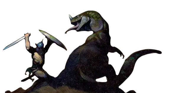
Sometime around the mid 1980s Frank did a group of Death Dealer watercolor prelims and between 1984 and 1990 he did 5 fully finished DD oil paintings. The 1st 4 of these were used as covers to DD paperback novels and the 5th painting was most likely intended for a 5th DD novel that never materialized(it was eventually used as a cover for a Verotik DD comic book in the mid 1990s).The 2 page spread of DD conceptual art(and early stages of some later finished DD paintings) to be found in FRANK FRAZETTA: BOOK FIVE(1985) strongly suggests that Frank had formed the visual game plan for the DD series covers years before the actual novels were written or published. If some people view DD paintings as illustrations they are completely wrong because the stories that they were supposedly illustrating didn't even exist when Frazetta first painted them.

While this might be viewed as the storytelling equivalent of putting the cart before the horse it worked well for Frank and the publishers he worked with. And there ARE some effective examples of visuals coming before the words in closely related entertainment fields. For Stan Lee's Marvel Method of comic book production the pencil artist would create the story kind of like a silent movie on paper and the writer would only do the word crafting for the captions, dialogue balloons, and thought balloons AFTER the pencil art was completed. Alfred Hitchcock used to previsualize almost every camera shot and scene in his movies BEFORE the scripts were written. Grace Kelly confirmed this when she revealed that while she and Hitch were filming principle photography for DIAL M FOR MURDER(1954) he told her the complete story from start to finish in exact detail and with every scene included for REAR WINDOW(1954) before a writer was even hired to create the RW screenplay.

I read the 1st 2 DD novels and greatly disliked them so I didn't bother reading the 3rd and 4th novels in the series. With no new FF art books being released in the 2nd half of the 1980s(and none even planned) during this time I went back to my 1972 roots of buying paperbacks for their FF covers and not giving a hoot about their literary contents.
Frank's cover painting for FRANK FRAZETTA'S DEATH DEALER BOOK 2: LORDS OF DESTRUCTION was 1 of his very best paintings of the 1980s. It projects a beautiful sense of peaceful tranquility despite the obviously macabre elements of the bubbling, floating skeletal remains and the bloody oversize battle axe. The superb subtle color scheme plays off the neutral silvers and grays of the DD figure with the much warmer earthy browns of the background and foreground water. Frazetta effectively uses bright red color accents for the helmet eye slits and dark cool Alizarin Crimson for the dried axe blood. This painting was produced as a poster from Frazetta Prints.

The repainting of DD III was much looser and expressionistic, and far more overtly colorful than the 1st version. 1 notable change is that DD is wearing some sort of full length chainmail skirt in the repainting which completely covers his legs. While I like the repainting I still greatly prefer the formal perfection of the cover painting and wish that Frank had done the repainting on a 2nd piece of canvas board and spared the far superior original.
The repainting made its public debut in FRANK FRAZETTA: BOOK ONE with the slightly misleading title of DEATH DEALER II(Revised).
THE TEMPEST(1988)(oil painting)(copyright date 1988)/THE TEMPEST(2003)(oil repainting)

THE TEMPEST was originally done as an advertisement for the Heurikon Corp. This painting was a reimagining of Frank's classic painting THONGOR AGAINST THE GODS(1967) which wasn't the same as a repainting because the overall composition was totally changed.
THONGOR AGAINST THE GODS(1967)
The methodology of this ad was somewhat akin to Frazetta's movie poster art for FITZWILLY(1967) in that it married Frank's art with some actual photography(FF didn't take the photos himself in either case). In the original painting of TT the hero was holding up a large pure white horizontal rectangle shape that was being struck by lightning at the top. The Heurikon people inserted a photo of their microprocessor into the white rectangle.
FF has gone on the record that he was "almost dead" when he painted TT, apparently reaching a dangerously low point with his then-undiagnosed thyroid condition. This would explain the obvious and painfully low artistic quality of TT(especially when compared to its inspiration TATG).
In 2003 FF decided to turn this former ad into a fully finished painting. He added a sword to the hero's left hand. The lightning bolt was extended in a downward jagged diagonal arc striking the tip of the sword with a refracted straight line light beam going from the sword to the viewer's right edge of the painting. The rest of the white rectangle was filled in with dark brown. Simple.
FRANK FRAZETTA'S DEATH DEALER BOOK 4: PLAGUE OF KNIVES(aka DEATH DEALER V)(1989)(oil painting)(copyright date 1989)/DEATH DEALER V(date unknown)(oil repainting)
I really enjoy the color mass of cool red that dominates the middle background space of this cover painting and its super slick rendering of the darkened battling figures. You can almost see Frank's struggle with his health condition to bring this painting to a successful resolution and that struggle makes this painting strangely compelling.
The repainting is much more confident and self assured. While the original is smooth and slick the repainting is more textured and somewhat lighter and brighter with additional color variety. The copyright date of 1989 is retained, but my best guess is that FF did this repainting sometime in the 1st half of the 1990s during his short lived medical recovery that restored his full fledged painting functionality.
This 1 is pretty much a split decision for me: I like both of these paintings fairly equally but for different reasons. The repainting premiered in FRANK FRAZETTA: BOOK ONE and became the painting of choice for the poster.
HEAVY METAL volume 14 #5(aka PRINCESS AND THE PANTHER)(1990)(oil painting)(copyright date 1990)/PRINCESS AND THE PANTHER(date unknown)(oil repainting)

The repainting for this cover was an easy operation. On the cover the princess is wearing an elaborate necklace and bikini combo. Frank paints these out and makes her totally nude in the repainting. While I am certainly no expert on HEAVY METAL(having never read a single issue) my general impression is that they allowed female nudity for their interior pages. If this was indeed the case why did they have a more prohibitive nudity policy for their covers? It seems quite silly that Frazetta at the late date of 1990 was still having to do a self censored version for a cover only to restore full nudity later on.
Another odd thing is the almost monochromatic repro that PRINCESS AND THE PANTHER received for the HM cover. Every subsequent reproduction of the repainting I've seen always has much more appealing green tonalities in the painting that I'm guessing were present and accounted for in the original cover painting. So why did HM give it such insensitive cover repro quality with all the greens almost totally washed out?

This painting was a pretty obvious direct sequel to Frank's personal favorite CAT GIRL repainting. The color scheme here is a brilliant study of contrasts with the long somewhat curly platinum blond hair of the princess being a wonderful highlight of the surrounding dark greenish swamp and perfectly complemented by the black panther. Only Frazetta could conceive of a composition like this and paint it so well.


CAT GIRL
PATP and FF's movie poster art for GHOSTS CAN'T DO IT(1989)(unfortunately unused in 1990) were proof positive that Frank was still capable of doing excellent art in 1989/1990 despite his ongoing health problems.

The repainting of PATP debuted in FRANK FRAZETTA: BOOK ONE and reappeared a short 2 years later in ICON(1998). Numerically speaking it was the final poster produced by Frazetta Prints(most likely in 1996).