FRAZETTA: KING OF PAINT
Chapter 7: 1970
by Paul Vespignani
A PRINCESS OF MARS (1)(1970)(oil painting)/A PRINCESS OF MARS (2)(1970) (oil repainting) (copyright date 1970)

A PRINCESS OF MARS (1)(1970)(oil painting)

A PRINCESS OF MARS (2)(1970) (oil repainting) (copyright date 1970)
As for the green, 4-armed alien on the ground I think his perfectly circular head from #1 works much better than his more oval shaped head from #2.

FRANK FRAZETTA: BOOK FOUR (1980)
THE ETERNAL CHAMPION(1970)(oil painting)/THE ETERNAL CHAMPION(1994)(oil repainting)(copyright date 1970)

THE ETERNAL CHAMPION PAPERBACK COVER (1970)(oil painting)
Frazetta's cover painting THE ETERNAL CHAMPION has always looked like an unfinished rush job to me, particularly in regards to its very simple yellow background. NOW when I look at the background the darker yellow tapered streaks almost look like Frank's quiet tribute to the tapered "action lines" pioneered by Jack Kirby and Joe Sinnott in their THE FANTASTIC FOUR comic books from the 2nd half of the 1960s.
Frank and Ellie apparently felt good enough about this cover painting to include it in FRANK FRAZETTA: BOOK FOUR (1980) and release it as a poster. However by 1994 the unfinished nature of this painting must have been bugging Frazetta because he gave it a 100% repaint(but maintained the original composition exactly) and made it even more than 100% better. This is probably Frank's most sensible repaint job: he took an unfinished painting and simply finished it. It is one of his best repaintings.
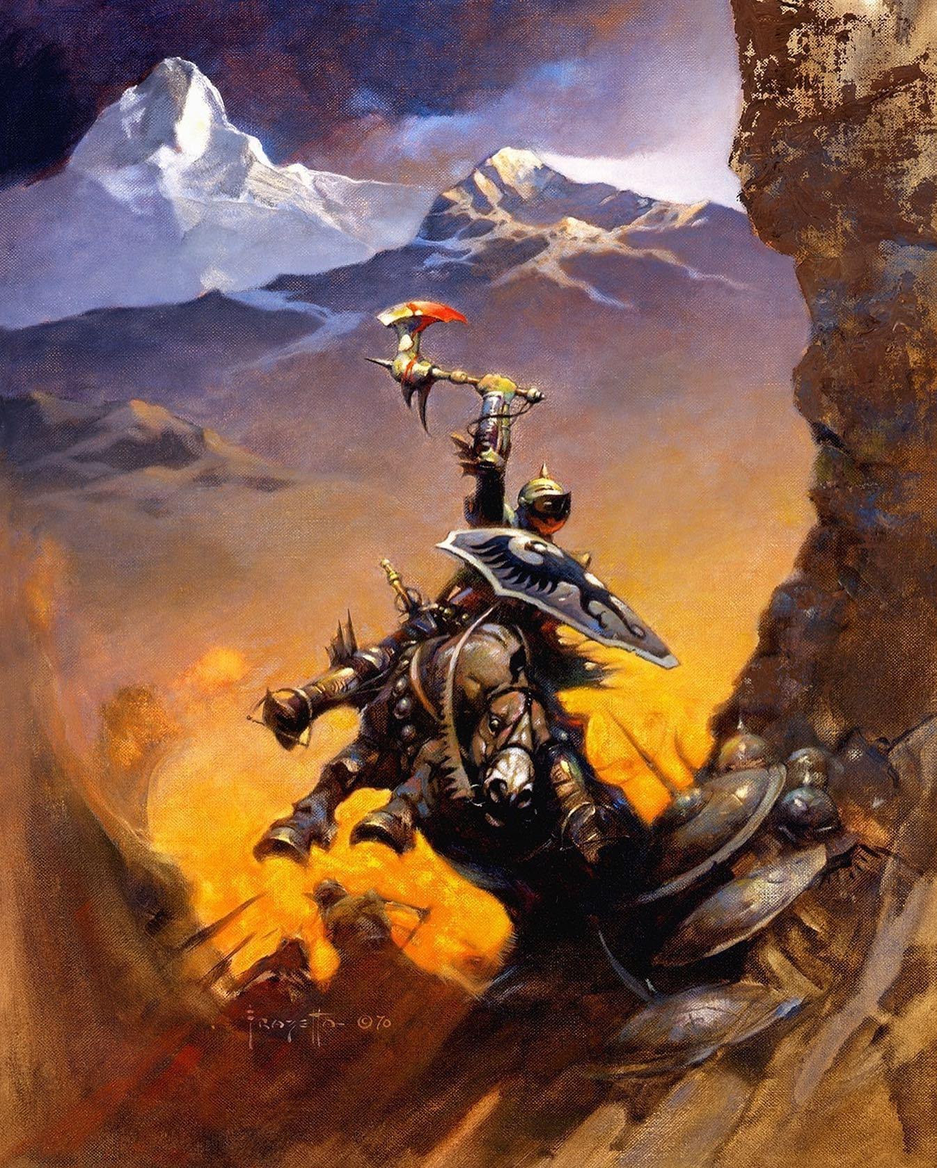
THE ETERNAL CHAMPION(1994)(oil repainting)(copyright date 1970)
The armored hero on horseback went from a sort of green monochrome in the original to more bluish silver tones better suited for armor with a nice red underglow added to his face plate. This red harmonizes nicely with the key focal point of his upraised bloody axe. The axe itself gets some much stronger white highlights and the axe blood has more subtle variations than the solid blood red of the original. The hero's shield has been completely reshaped and redesigned and is SO much better than the plain ol' shield of the 1st version. The horse also loses the green monochrome in favor of a much more sensitive horse colorations.
The simple yellow background is replaced by a beautiful landscape of arctic mountain ranges. Frazetta comes up with a powerful color scheme for this background with orange tones and Raw Sienna immediately surrounding the hero and his horse which slowly and surely modulates to the more cool colors of the landscape.
This repainting never appeared in Frank and Ellie's self published FRANK FRAZETTA: BOOK ONE (1996), but instead made its public debut in LEGACY (1999).
THE HIGH SIDE(1970)(oil painting)/THE HIGH SIDE (aka DEVIL RIDER)(date unknown)(oil repainting)

All things considered, the DEVIL RIDER repainting is superior to THE HIGH SIDE cover painting, although the blond woman in the magenta bikini from the original might be the most beautiful female Frank has ever painted. Why he felt that SHE needed to be repainted is something I will never understand(however blond woman #2 is also awesomely lovely).
DR is a 100% repaint but the drawings/composition of the standing male, the motorcycle, and the large laughing devil head in the background are all faithfully retained. The POSE of the #1 woman is reused for the #2 woman, but #2 woman has a completely different figure and face and her face is in pure profile(as opposed to the 3/4 view of the 1st face).
The laughing devil head in the background is given much more depth and color/value contrast and is more satisfyingly rendered vs. the much simpler light and middle gray tones the head was given in the original. Frazetta sticks with the original graphic design for the devil head but the head has far more color subtlety in the repainting.

THE HIGH SIDE(1970)(oil painting)
The motorcycle is repainted with brighter extra colors (compared to the monochromatic gray tones of the original motorcycle) and the male and female are given much more deeper suntans. Her bare breasts are somewhat whiter, indicating she has been sunbathing with her bikini top on..a nice visual touch by Frank.
DR made its 1st official appearance in FRANK FRAZETTA: BOOK FOUR, but was not deemed worthy by Frank and Ellie to be produced as a poster(why not?). Frazetta put a copyright symbol next to his signature, but no date. DR also made an earlier UNOFFICIAL appearance in THE FRAZETTA TREASURY (1975) which was a publication done without Frank and Ellie's involvement or approval. This means the DR repainting was done sometime between 1970 and 1975.

THE HIGH SIDE (aka DEVIL RIDER)(date unknown)(oil repainting)
STRANGE CREATURES FROM TIME AND SPACE(1970)(oil painting)/STRANGE CREATURES FROM TIME AND SPACE(date unknown)(oil repainting(1)/STRANGE CREATURES FROM THE TIME AND SPACE (date unknown)(oil repainting (2))


STRANGE CREATURES FROM TIME AND SPACE(1970)(oil painting)

STRANGE CREATURES FROM TIME AND SPACE(date unknown)(oil repainting(1)

STRANGE CREATURES FROM TIME AND SPACE (date unknown)(oil repainting (2))

STRANGE CREATURES FROM TIME AND SPACE (date unknown)(oil repainting (2)) Displayed on Frazetta's easel in his home studio (2009)
MONSTER FROM OUT OF TIME (1970)(oil painting)/MONSTER FROM OUT OF TIME(aka LAND OF TERROR(oil repainting) (1967)

MONSTER FROM OUT OF TIME (1970)(oil painting)

MONSTER FROM OUT OF TIME(aka LAND OF TERROR(date unknown)(oil repainting)
JONGOR OF LOST LAND (1970)(oil painting)/JAGUAR GOD 1(1994)(oil repainting) (copyright 1994)

Probably the most interesting thing about Frank's painting for JONGOR OF LOST LAND is that it looks more like a painting by Jeff Jones than it does a painting by Frazetta. For years Frank and Jeff were members of a 2-man Mutual Admiration Society so it should not be a surprise that Frazetta would do a Jones-style painting either consciously or subconsciously. Such a shame that this painting is so strangely flat and lifeless. In an audiotaped interview from 1994 Frank called the cover painting for JOLL: "a pretty hopeless piece of work."
One truly bizarre anatomical anomaly that these 2 paintings share is that both of the hero's arms do a complete disappearing act right around the elbows. I think Frazetta's original strategy here is that the 2 apemen are grabbing the hero's arms to restrain him and that THEIR arms and bodies would block the hero's arms(from the elbows to the hands) from the viewer. Unfortunately Frank did not convincingly pull this off in the design OR the figure drawing. The flaw is even more noticeable in the JAGUAR GOD 1 repainting because the JG character is much more contrasty than the more subtle painting of the Jongor figure. This situation is even exacerbated in the JG 1 repainting with only the tops of JG's legs showing(presumably they are obscured by the high jungle undergrowth, but this is only vaguely indicated). In the JG 1 repainting it looks as if the apemen are manhandling a head and a torso that has had his arms and legs amputated. Maybe FF was hoping that people would not notice this(or even worse, that they didn't care) but once you are aware of this it is kind of hard to NOT notice it.
If you are willing to overlook JG's freaky anatomy(and I certainly am) the JG 1 repainting really is a superb work of art featuring beautifully dark color combinations and a lush jungle atmosphere that is quite intoxicating. The JG 1 repainting is light years better than the totally failed JOLL cover painting.

JONGOR OF LOST LAND (1970)(oil painting)
It is intriguing that Frazetta repainted his 2 weakest paintings from 1970(JOLL and THE ETERNAL CHAMPION) in 1994. 1994 was a good year artistically for Frank. At that time he was enjoying a short lived oasis of good health with completely restored painting functionality.
The visual look of the JG character was most likely fully created by Frank in the repainting process with rocker/publisher Glenn Danzig coming up with the character's name and backstory based on the image. Glenn was borrowing a page from Stan Lee's "Marvel Method" playbook: have the artist do the heavy creative lifting and later shoe horn the word crafting in as a kind of afterthought.
Frazetta had zero interest in comic books by 1994, but he was OK using comic books as a venue for presenting his cover paintings to the general public. What Warren was to Frank in the 1960s and the start of the 1970s, Danzig's Verotik was for him during the mid -1990s.
Frazetta's all new painting for Jaguar God 2(1995) was one of his very best paintings of the 1990s and a painting that could hold its head high with any of the FF classics from the 1960s and 1970s.
JAGUAR GOD 1(1994)(oil repainting) (copyright 1994)


JAGUAR GOD 2(1995)(oil painting)


0 comments