Frazetta the Abstract
by Steven C. Ringgenberg
Few fans of Frank Frazetta would characterize him as an abstract artist, but on rare occasions, Frazetta did veer into the realm of abstract art and even surrealism to achieve a particular effect, or perhaps because that fit the needs of a particular assignment, or simply out of a desire to try something new. Frazetta is best known, of course for his paintings of heroic figures like Conan the Barbarian, Tarzan, John Carter of Mars, Brak the Barbarian and a whole slew of brawny, larger than life men and voluptuous women.

Downward To Earth
Another example of Frazetta using an abstract technique is in his striking painting for the paperback collection The Devil’s Generation (Lancer Books, 1973). Here, he uses an abstract impasto technique to depict the black magic energy being summoned by the skull-faced sorcerer. It’s not easy to see on the paperback cover because the title lettering obscures most of it, but as shown on prints, the wild, splashy energy really pops. Some of the magical energy looks like Frazetta employed the action painting technique of splattering paint pioneered by abstract expressionist Jackson Pollock. Again, this is a departure from Frazetta’s usual approach that had intriguing possibilities had he chosen to pursue it further.

Devil's Generation
Torment
Other examples of Frazetta employing a level of abstraction are the many paintings when Frazetta allowed the Masonite texture to show through on the works he executed using that type of painting surface. The first example of this technique, and one of his most famous works, is “Neanderthals”, done for the cover of Creepy # 15. It’s remarkable not only for the end result, but also because of the backstory of this masterpiece. This story has been told many times, so I’ll keep my recounting of it brief. Frazetta did this painting in 1966. He had a Monday deadline for his next Creepy cover, and as usual, Frazetta put off the job until the last minute, preferring to play sports or basically do anything but painting. Sunday rolls around and goes into the evening and Frazetta does not have a single piece of canvas board or anything else on which to execute his assignment, and living out in the wilds of 1960s Pennsylvania, the nearest art supply store is many miles away, and would’ve been closed on a Sunday night anyway. Ellie Frazetta was very upset, fearing Frank would blow his deadline, so she went to bed early with a headache.
However, after she turned in, Frank was struck with an inspiration. Remembering that there was some construction going on in the basement, Frank went down there, pried up a piece of Masonite from the floor and took it into his studio. Then he fell to work, knocking out one of his absolute masterpieces in around six hours. Frazetta used the brown of the Masonite to frame the primitive cavemen shambling towards the viewer through a curtain of mist. The only evidence of the haste with which this piece was executed is an indistinct face visible in the background that Frazetta only partially painted over. When Ellie emerged from the bedroom the next morning, she found Frank having coffee, with “Neanderthals” on his easel. When she expressed her surprise that he produced a painting in such a short time, Frazetta acted like it was no big deal.

Neanderthals
The happy result of this bit of artistic improvisation was that Frazetta decided he liked the way the Masonite took the paint, and he began using it frequently going forward, painting such gems as Kavin’s World (printed with the Masonite background showing through, and then subsequently revised by Frazetta to have a fully painted background, Monster From Out of Time, printed with the Masonite framing the dynamic central composition and, to the best of my knowledge, never revised. The simplicity of this piece is brilliant; there are only four figures and a bit of darkened ground in the midground. All four figures are in dynamic poses, especially the leaping Neanderthal and the human archer about to let fly with another arrow. Frazetta never revised this painting, which is entirely appropriate, as it is a jewel of simplicity and eye-catching design.
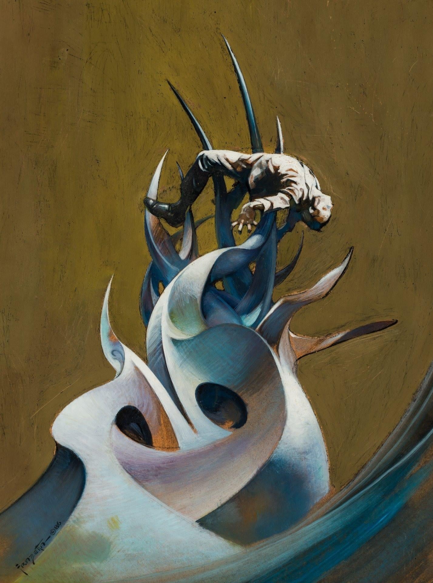
Another intriguing example of Frazetta’s use of Masonite is the cover for Warren’s
Vampirella #5, which shows a cavewoman and her mate confronted by a villainous-looking T. Rex, with the Masonite showing through the foreground space and even the legs of the two figures as well as showing through part of the T. Rex, with a spot of Masonite in the midground, and a tiny patch in the far background. The brown of the Masonite nicely complements the blues, greens and flesh tones that predominate in this piece.

Cover artwork for Vampirella #5 (Artwork titled "Cornered")
He could have easily gone back and finished up the foreground, covering the Masonite as he did with the reworked version of “Kavin’s World”, but as far as I know, he never did. A later Warren magazine cover is “Nightstalker” the cover to Creepy #32 (April, 1970). As with many of his paintings, the composition is simple but effective, his use of color is moody, conveying an atmosphere of subtle menace, of unimagined horrors soon to be released on an unsuspecting world. In kind with his cover for Vampirella #5, Frazetta allows the Masonite background to peek through figure and foreground, and it’s barely covered by the swirls of mist around the left side of the figure as if Frazetta did a few quick strokes to mute the background.
Besides liking the way the Masonite surface took the paint, the natural grainy brown
surface of the board provided an easy background for the perennially time-challenged Frazetta, who was notorious for waiting until the last minute to finish an assignment, and then usually knocking out a masterpiece, although this was not always the case. His cover for the first Brak the Barbarian painting is pretty minimal and the static central figure lacks the dynamism with which Frazetta imbued Conan and even Brak himself on the cover of Brak The Barbarian Vs. The Sorceress. Michael Kaluta nailed the way Frazetta could paint a simple figure that told an entire story in his “Appreciation” for Frank Frazetta that appeared in Testament: The Life and Times of Frank Frazetta (Underwood Books, 2001):..."Frazetta's concentration on The Figure As The Picture showed me how one could invent a world by presenting a well-conceived figure. It was in how that figure was dressed, their demeanor, pose and accoutrements that one sensed
the world in which the figure lived.
Idomitable

Frazetta didn’t leave any background of the painting surface showing on Conan the
Warrior (Lancer Books, 1967), titled “Indomitable” when it was issued as a poster, but the foreground of the painting is a soupy, amorphous mess of drab colors and barely defined figures, with a small, squatty Conan figure atop the mound of earth and writhing figures. The foreground looks as though Conan is fighting on a muddy hill, and unlike the sharply rendered figures on his other Conan paintings, this Conan is so undefined that he could be almost any generic barbarian. Still, this painting apparently appealed to art directors, according to Frazetta.
“Savage World” (used as a wraparound cover for Monster Mania #2, January 1967) is another piece that is a superb piece of storytelling, depicting a Neanderthal caveman abducting a cavewoman, with a horde of other Neanderthals in hot pursuit and some savage pterosaurs swooping down to pick off the pursing cavemen, while a pair of T. Rexes looking on with voracious interest. The impasto on the mountains and rocks in the image help to bring this fantastic scene to vivid life. This painting is one of many that Frazetta revised after publication, substantially improving some of the cavemen figures and changing the background. The revised version was issued as a non-limited poster printed on glossy paper. Interestingly, despite the scope of this scene, the original, which I’ve seen, is surprisingly small.


0 comments